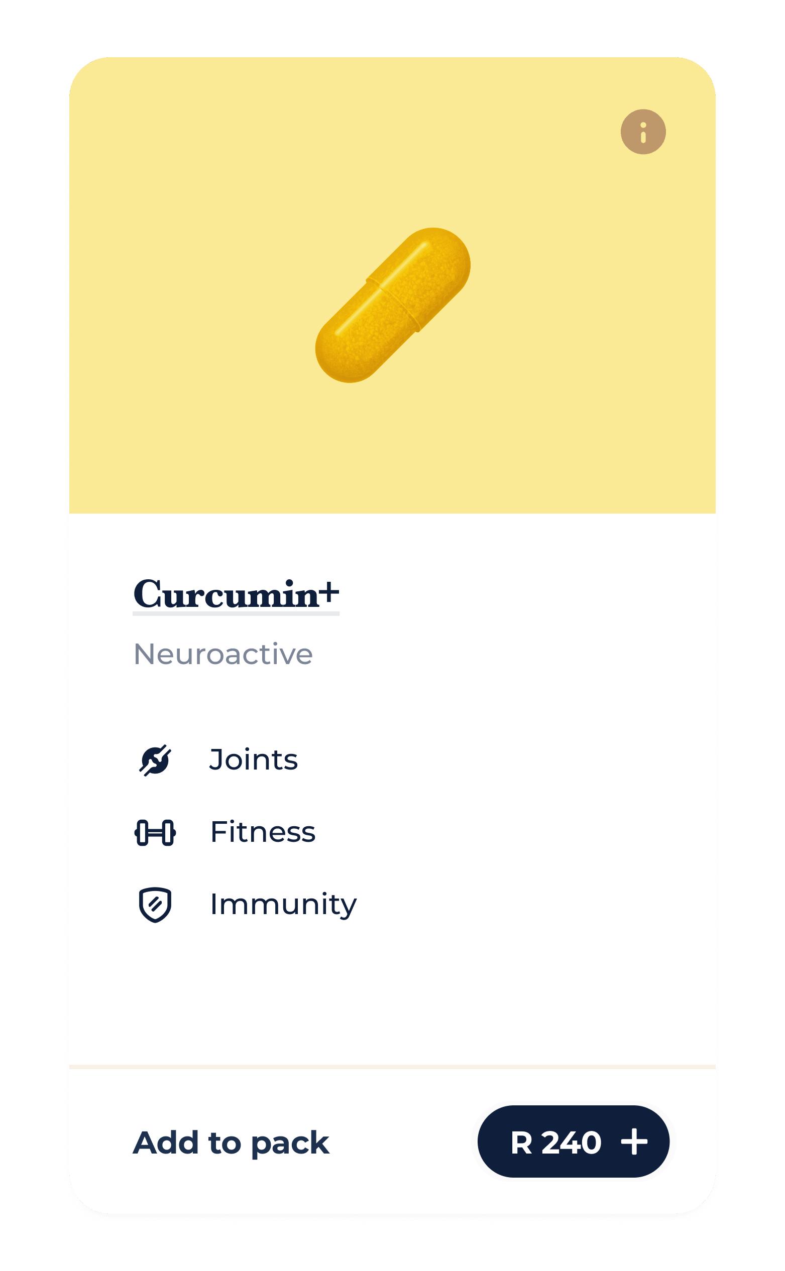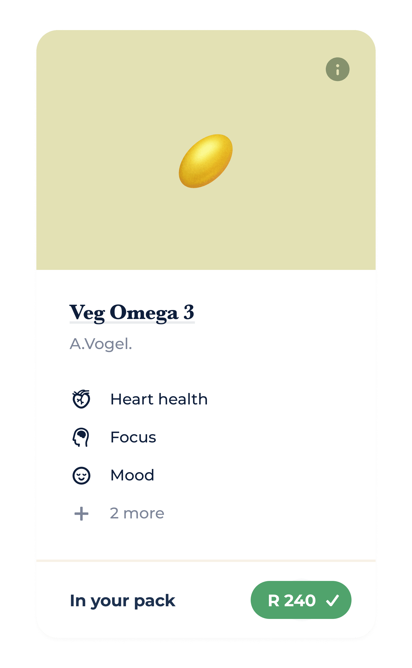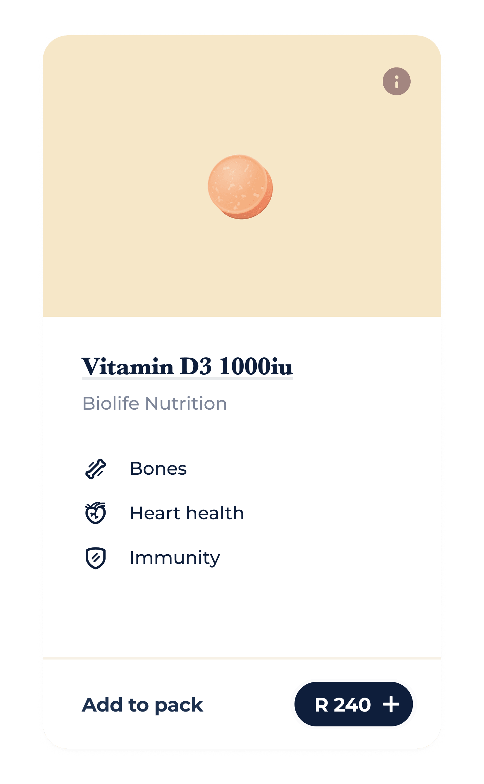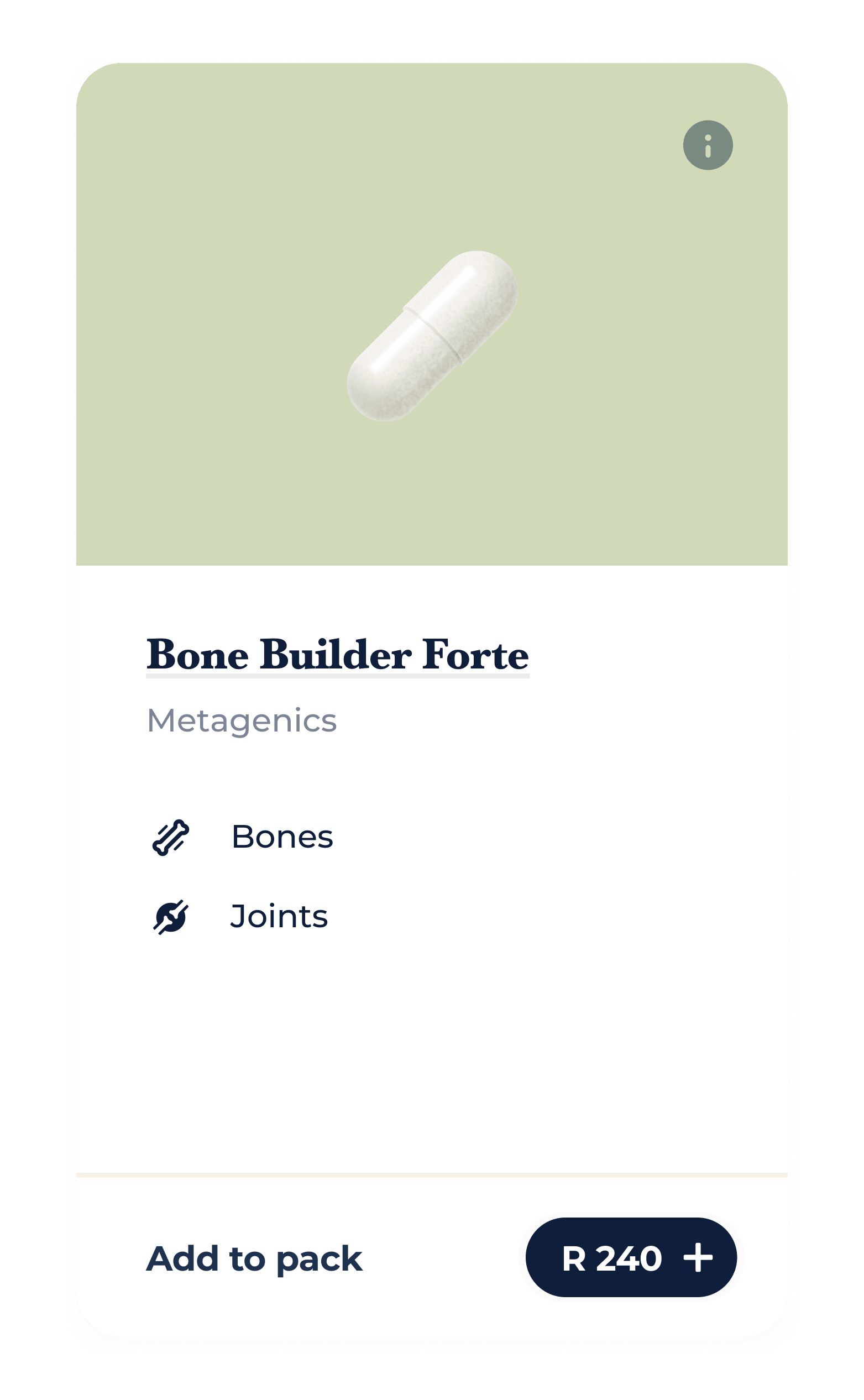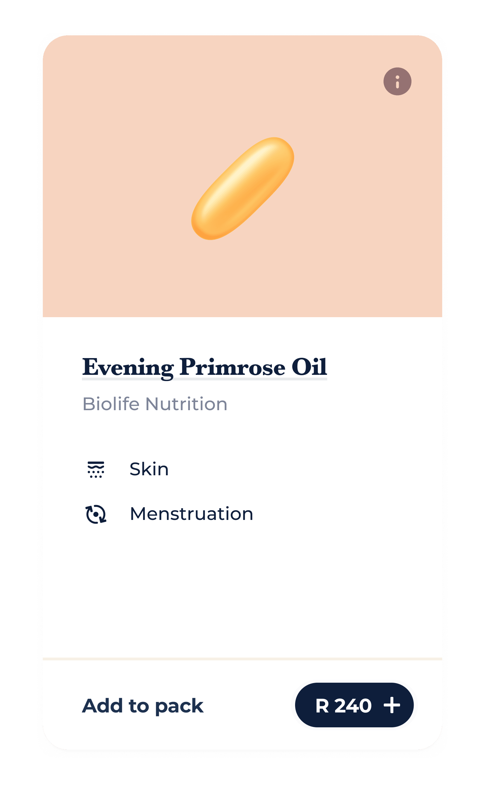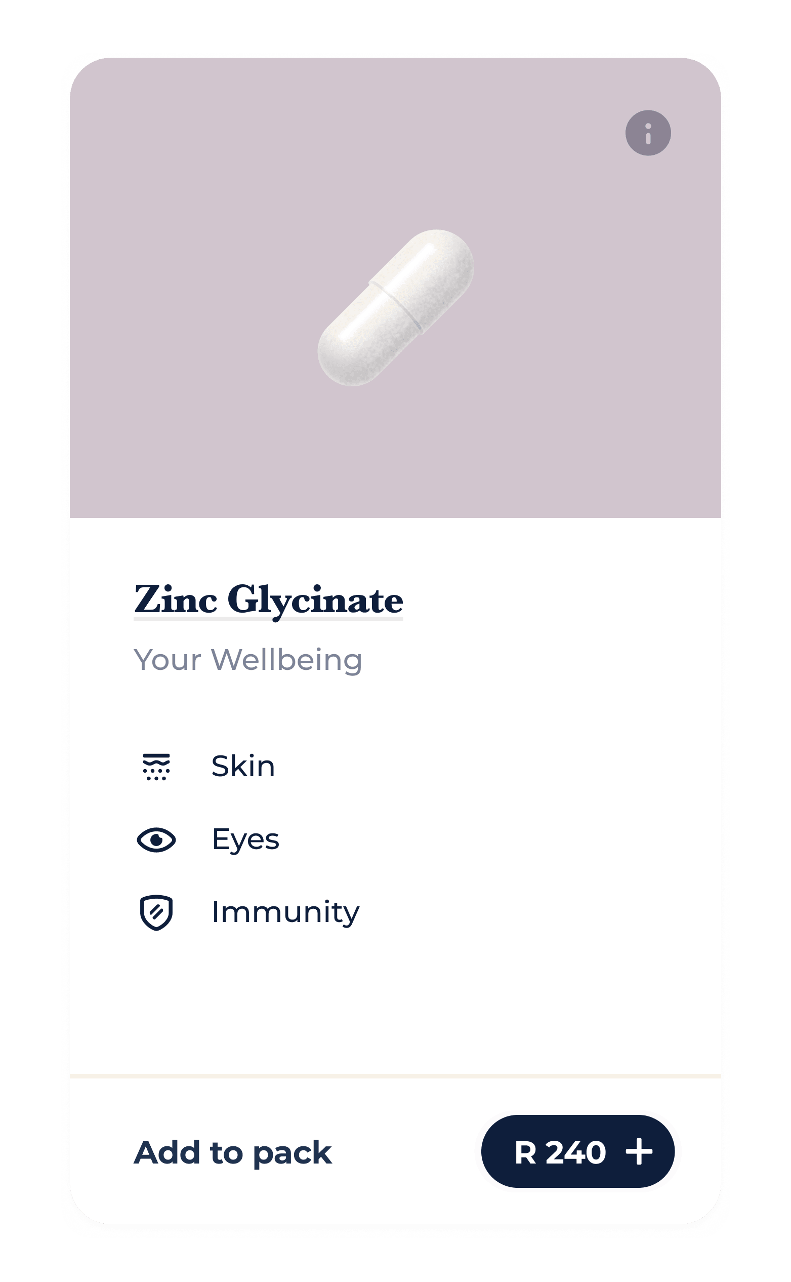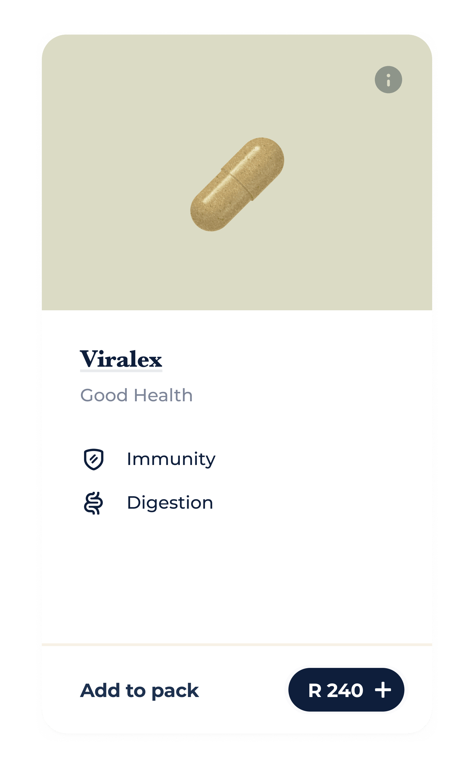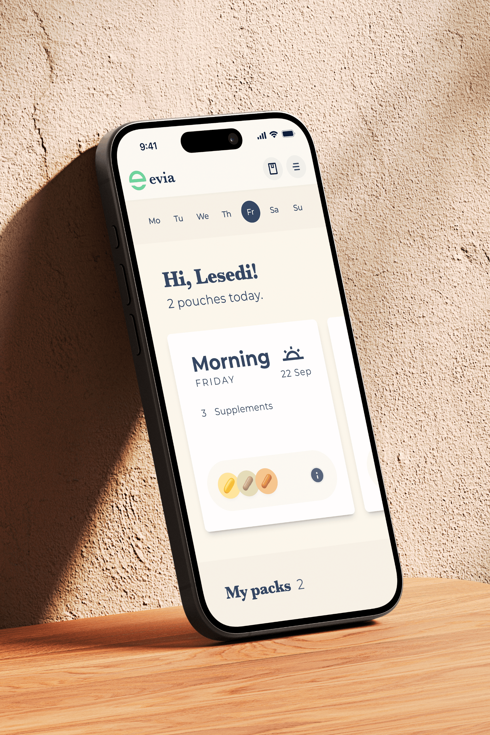
A bespoke approach to wellness
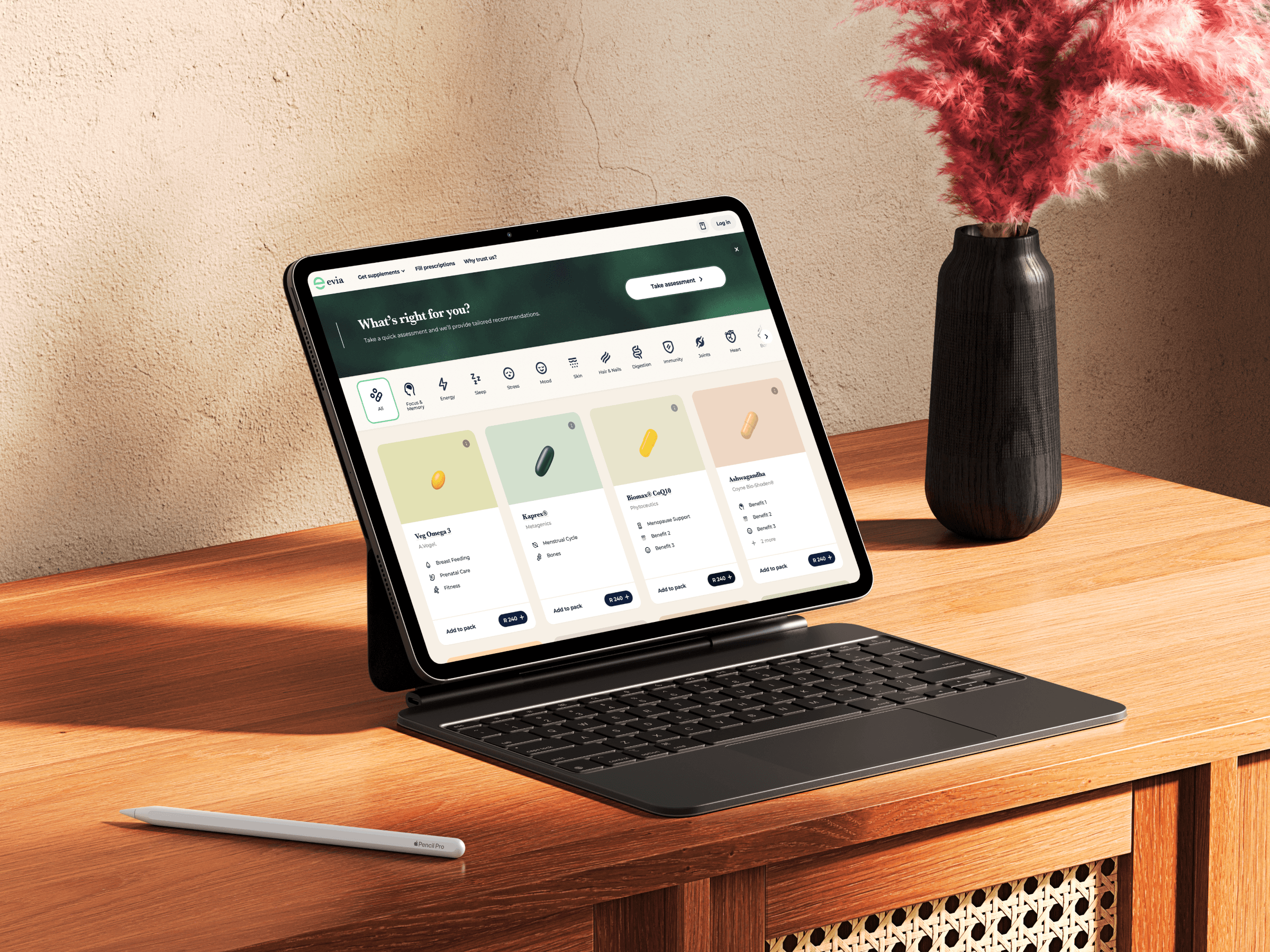
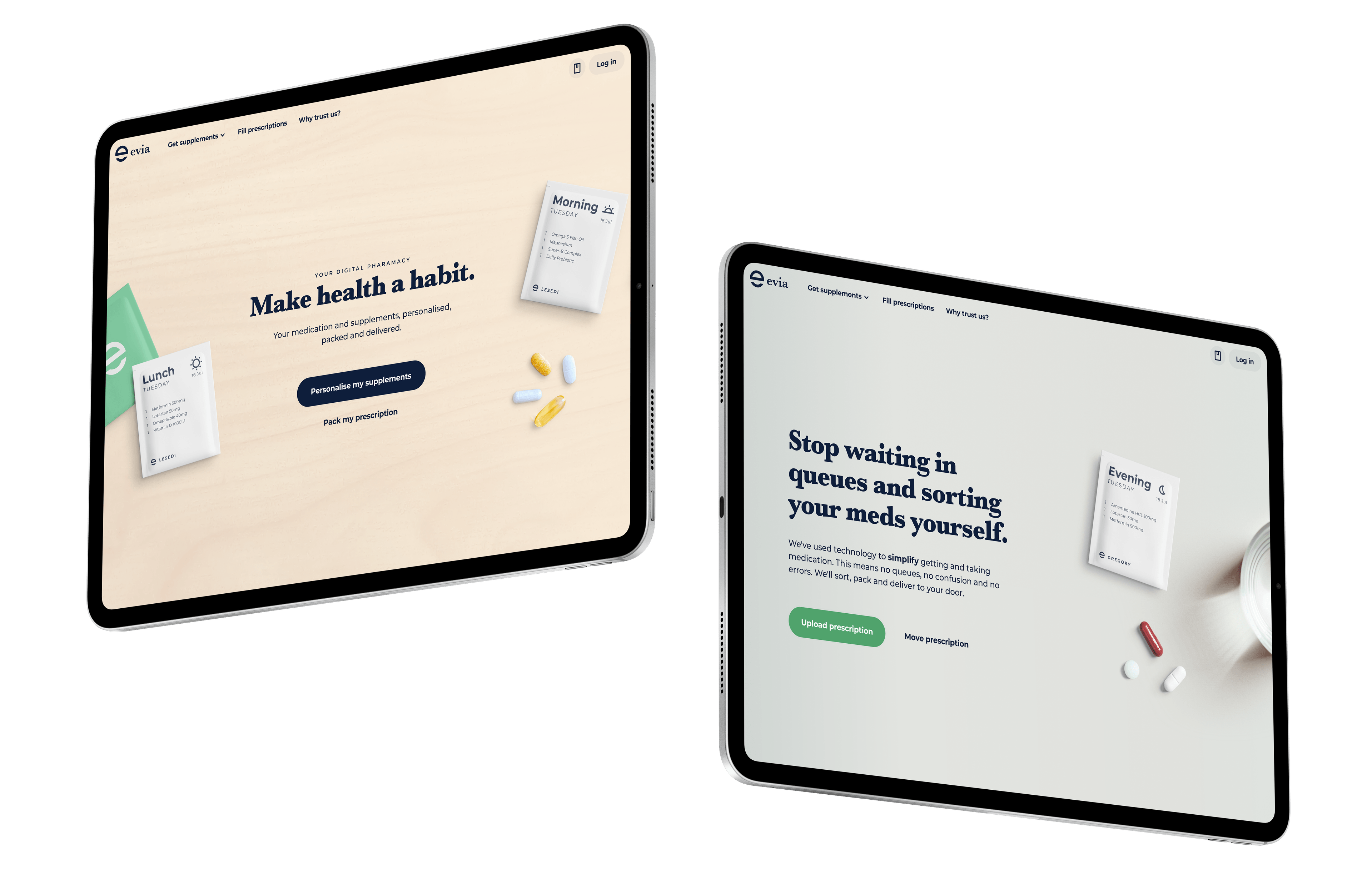
I designed Evia’s initial product, which sorted and delivered chronic medication. A year or so later, they returned to enlist me to design their expansion into the supplement market. This required significant navigational restructuring to ensure both systems could work seamlessly side by side.
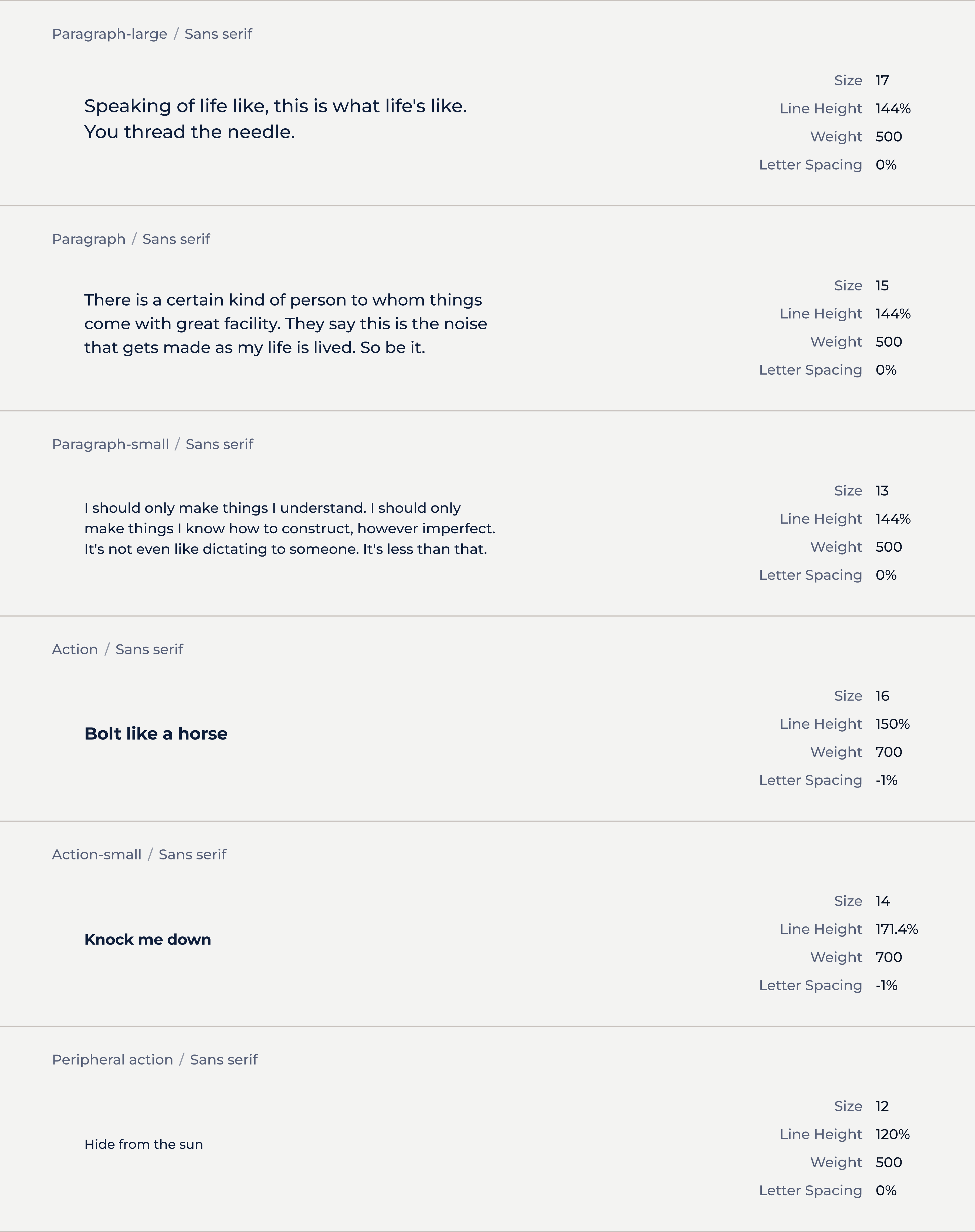
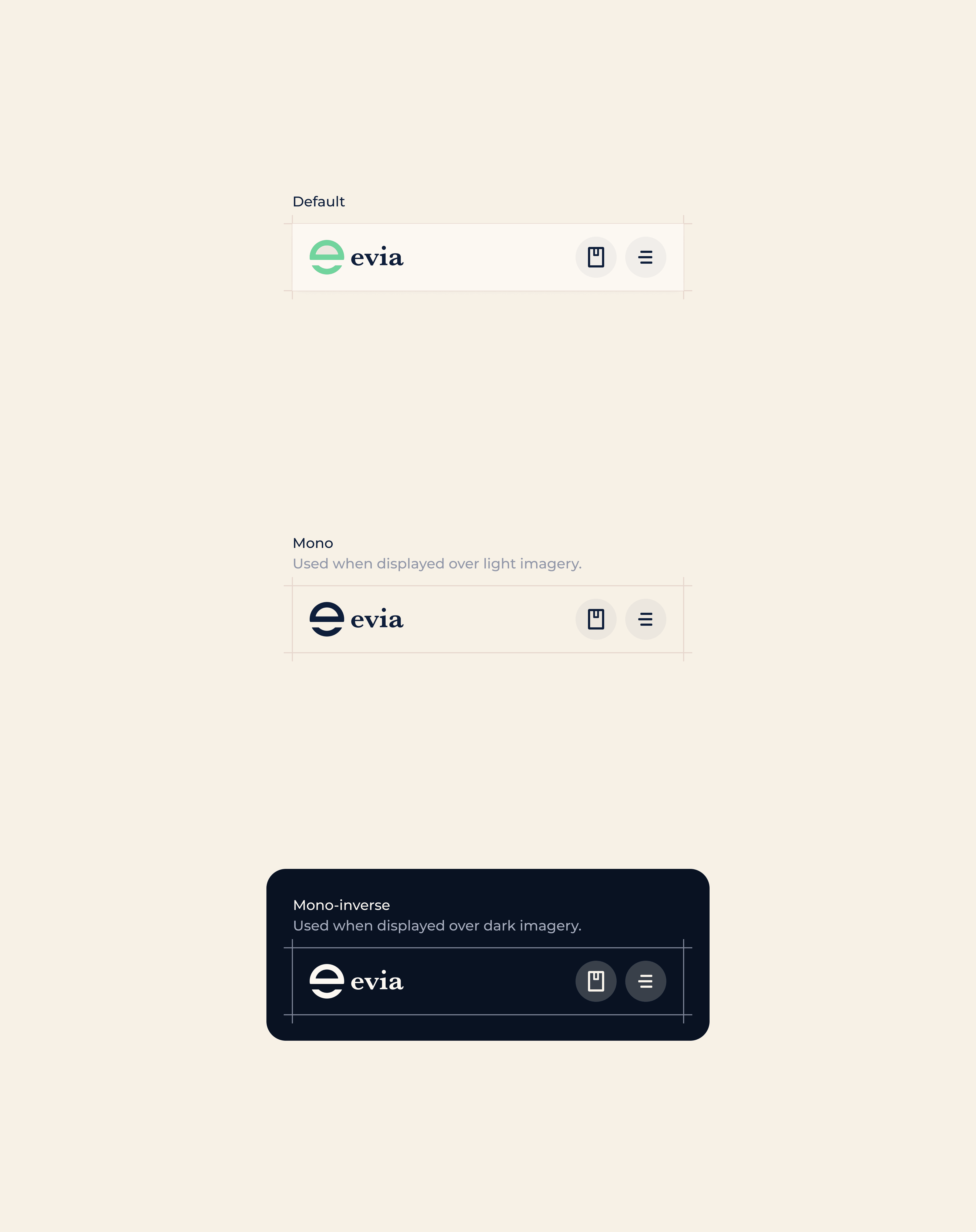
The expansion was paired with a rebrand to better suit the new audience, so the design system had to be adjusted accordingly.
Threading the stylistic needle
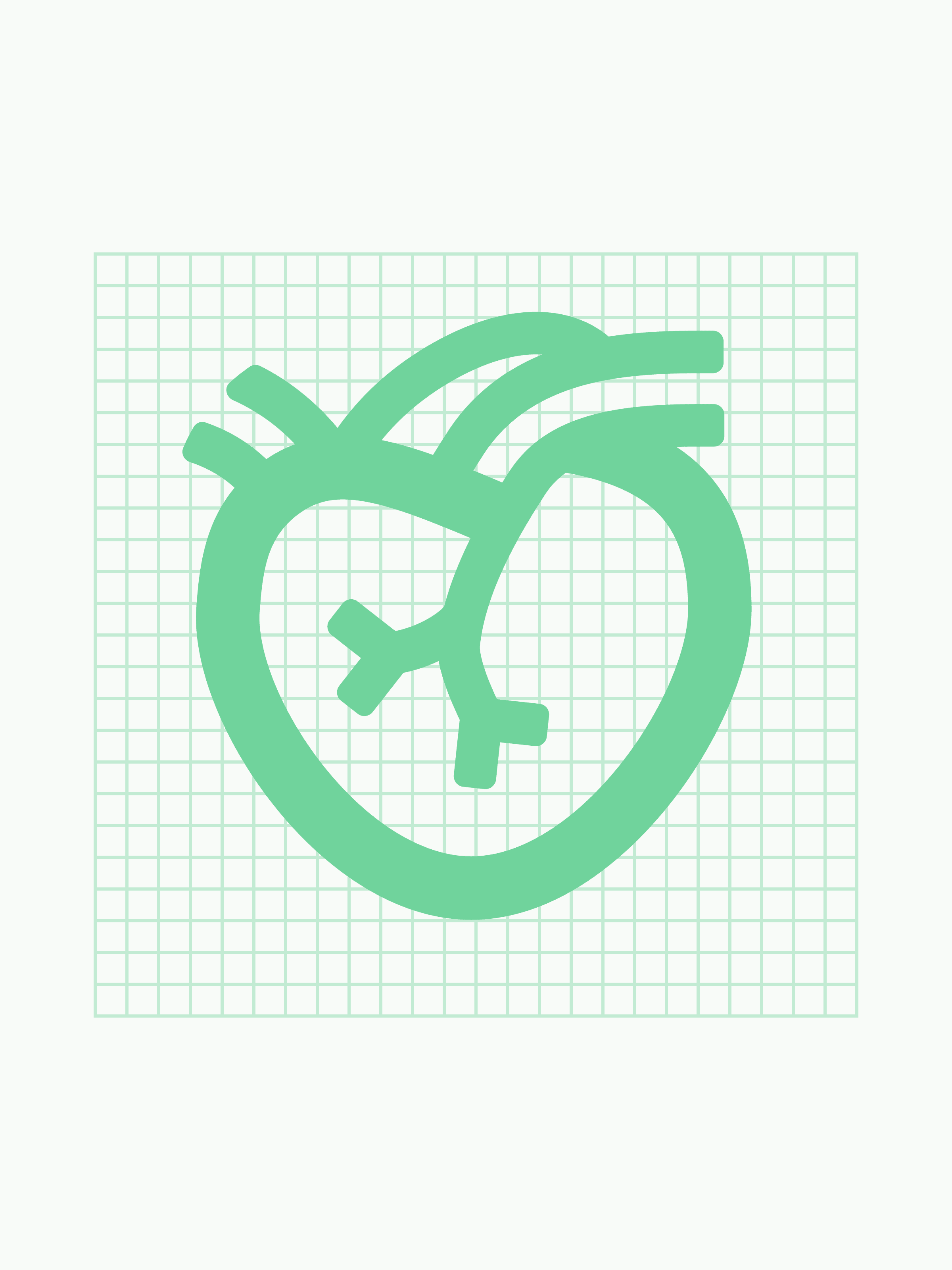
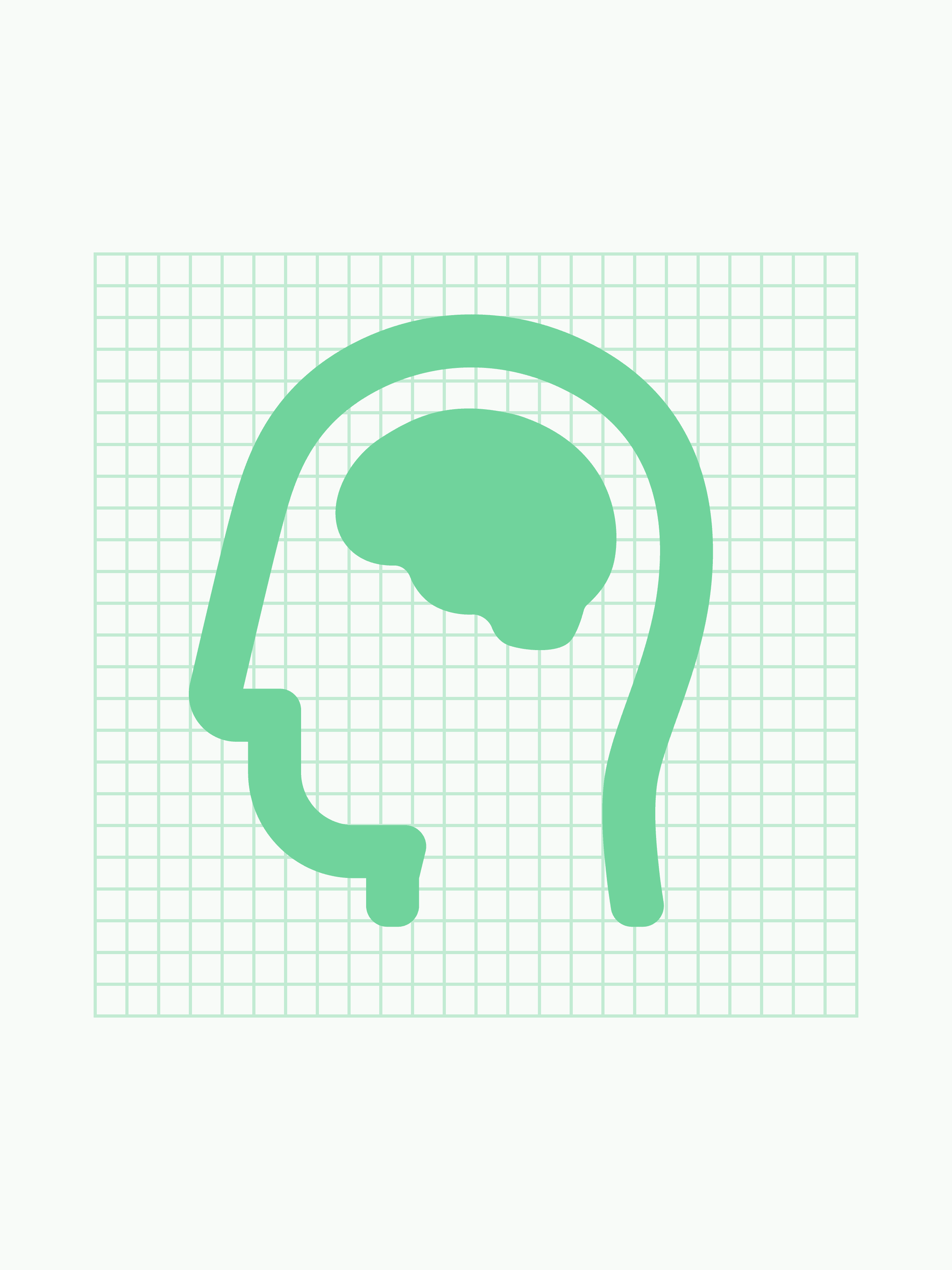
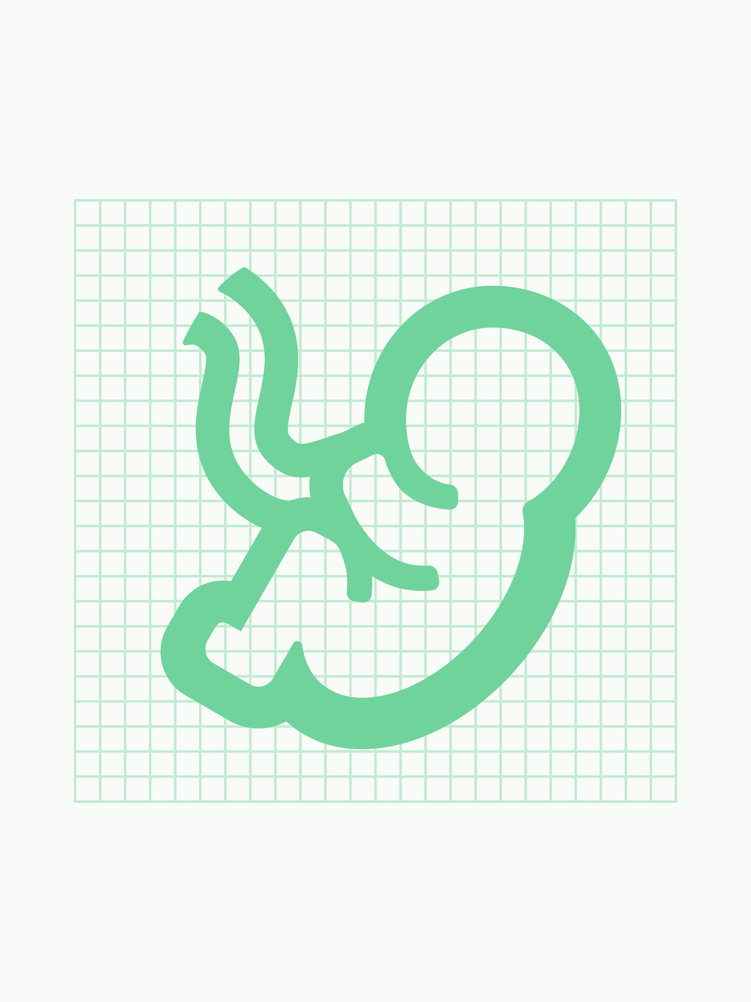
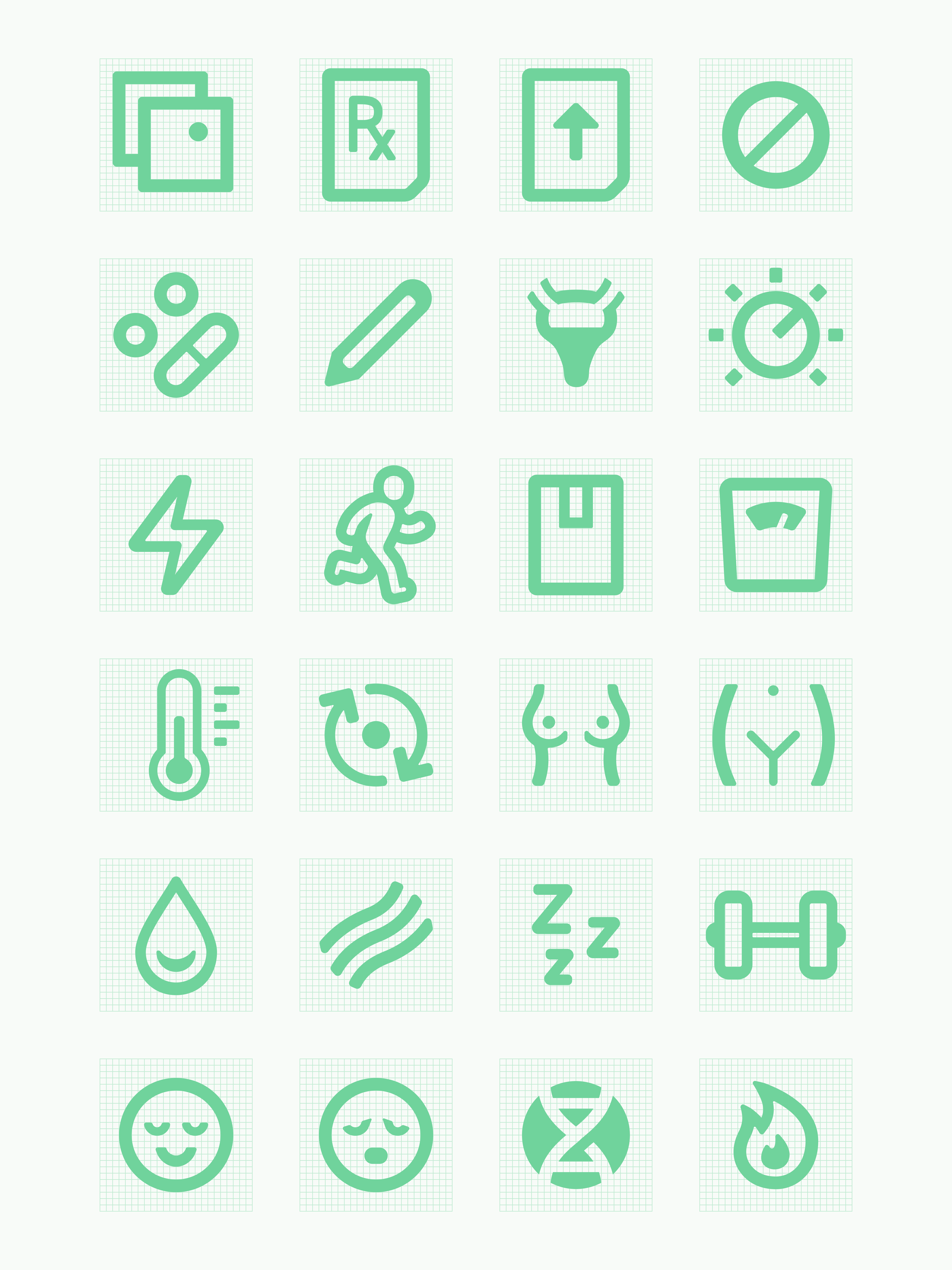
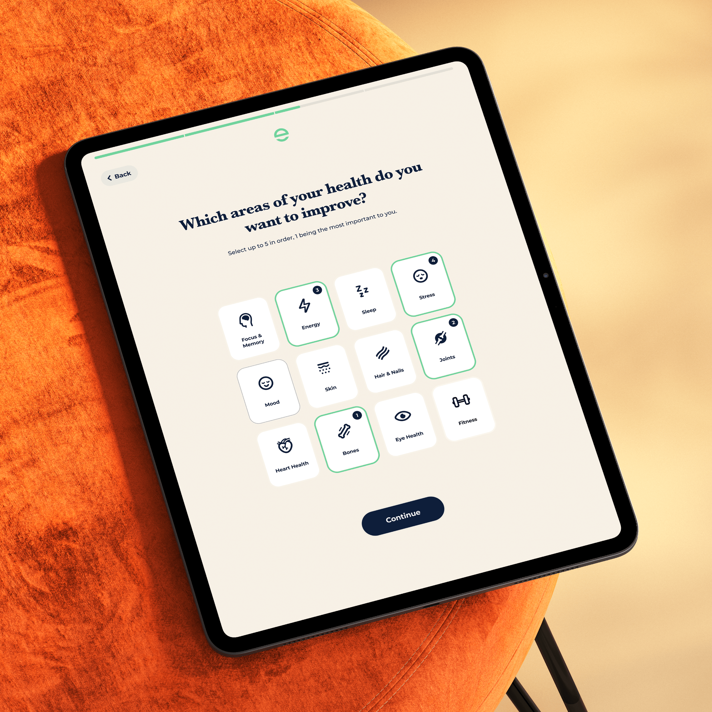
Constraints often foster new ideas. One request from Evia's marketing designer was to use bold iconography. I had planned to use quite fine icons to be able to capture the detail of scientific and biological objects (like hearts and intestines). Leaning into the bolder style led to a very satisfying style with a few varying stroke weights to produce a bold outline, but still capture detail.
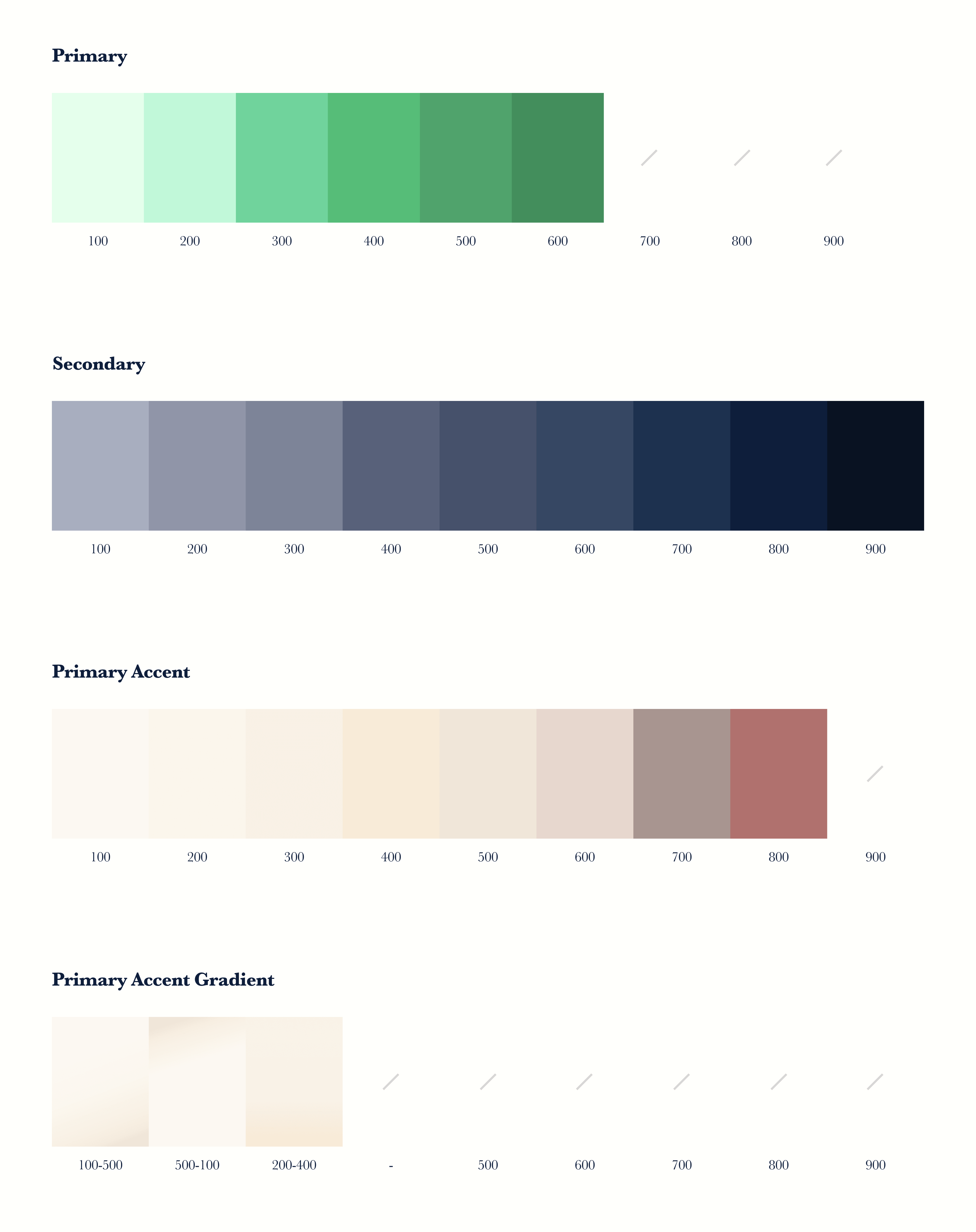
The branding constraints proved to have this effect in all sorts of areas; I found myself balancing on a knife's edge between having adequate colour contrast and maintaining the brand's soft, pastel palette. I really enjoyed the challenge though and I think the product it better for it. Design, after all, is all about balance.
Understanding the environment
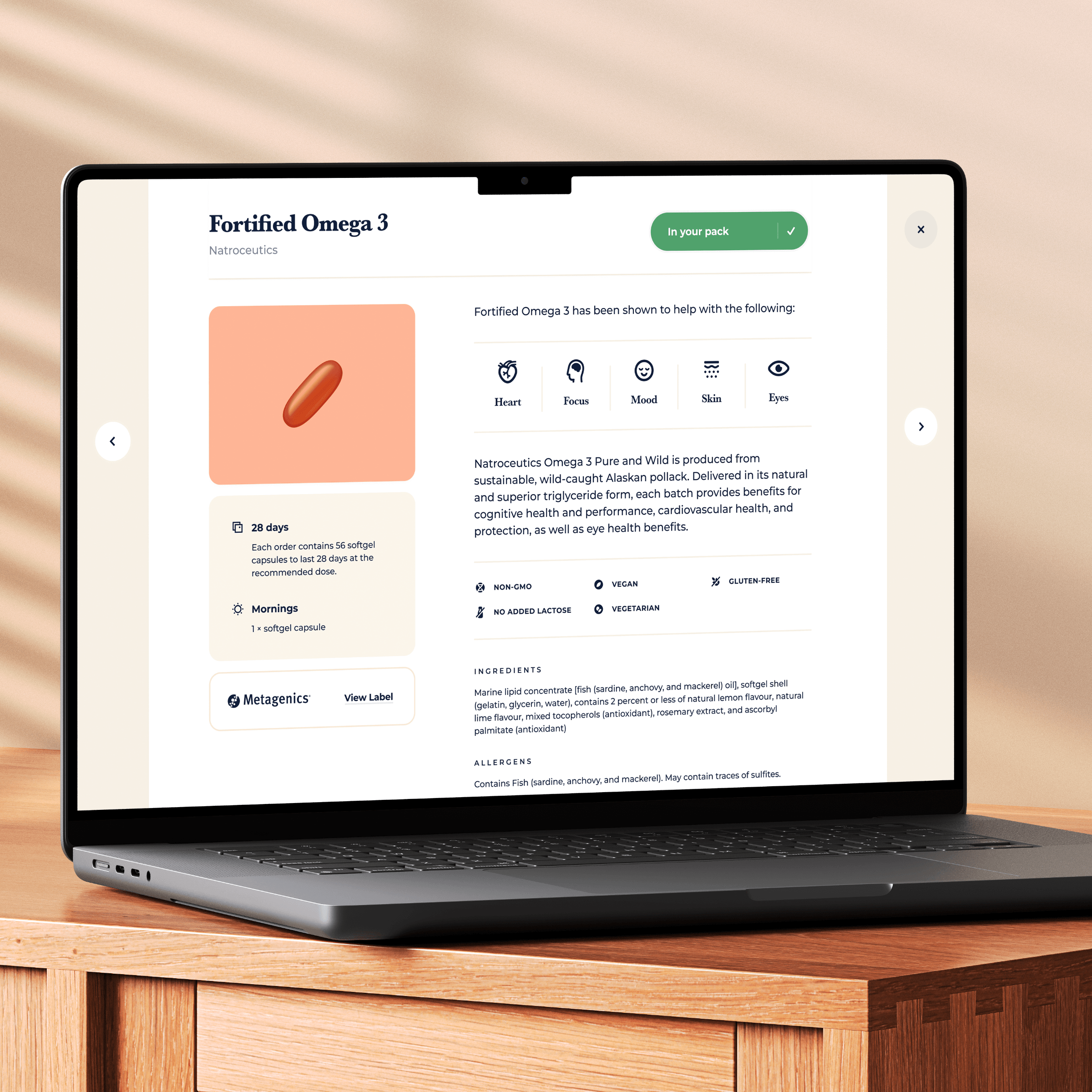
This was the first time we were going to be visualising the the actual capsules and tablets that Evia would be selling. In an ideal world, we'd have a supply of all the supplements to photograph in a studio, but that wasn't possible. In fact, the supplements on offer were constantly changing as the doctors refined their personalisation algorithms and the founders partnered with new suppliers. This is a great example of how design can't happen in isolation, the circumstances prompted me to investigate other forms of imagery.
When I was a teenager, I would customise system icons. The style was very skeuomorphic at the time, so I got some experience creating somewhat realistic looking objects. The style would be the perfect solution to this imagery problem. Supplements come in a handful of shapes and sizes, so I could create a few templates that could be easily adjusted through colour and texture to match different supplements.
An adaptive system
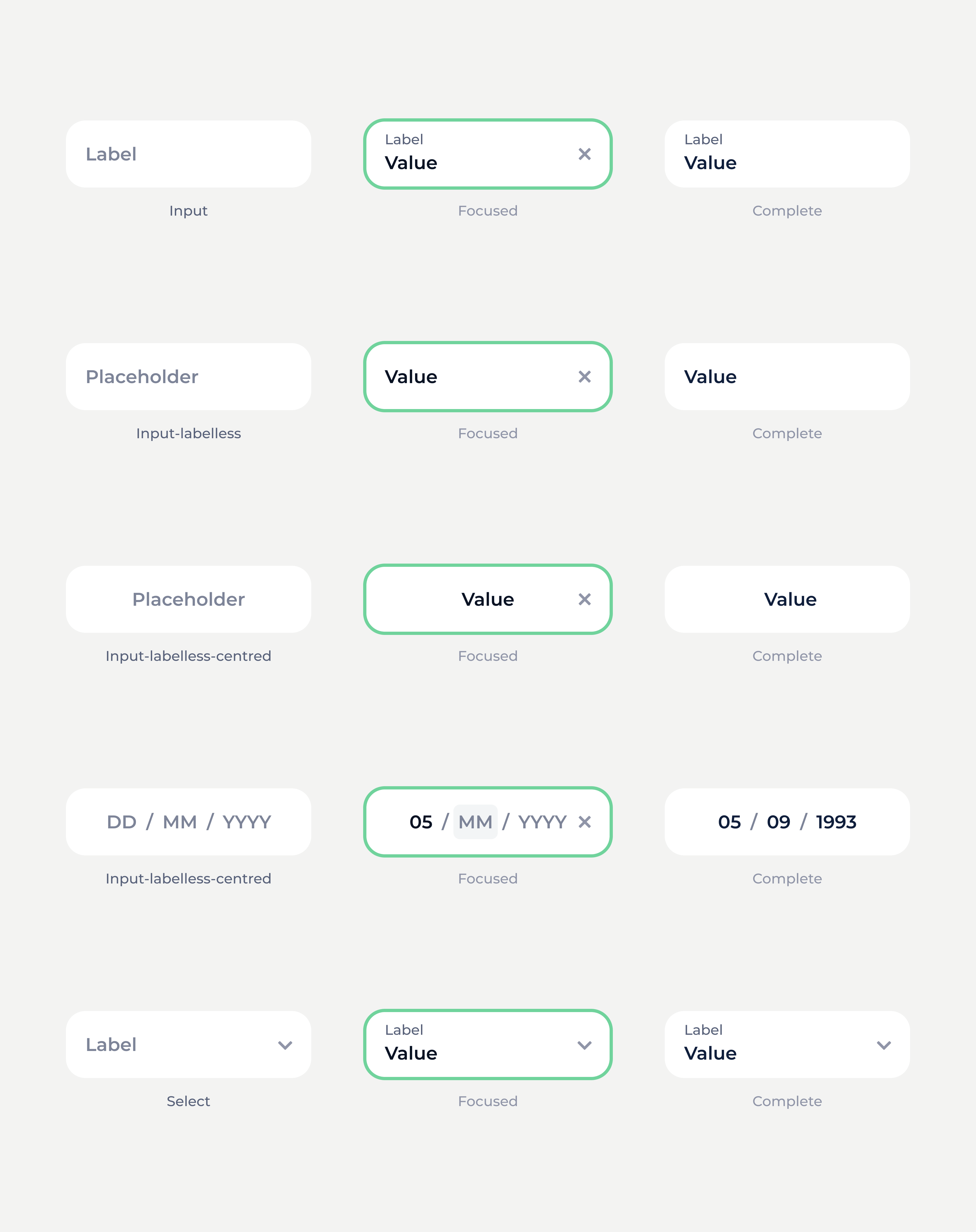
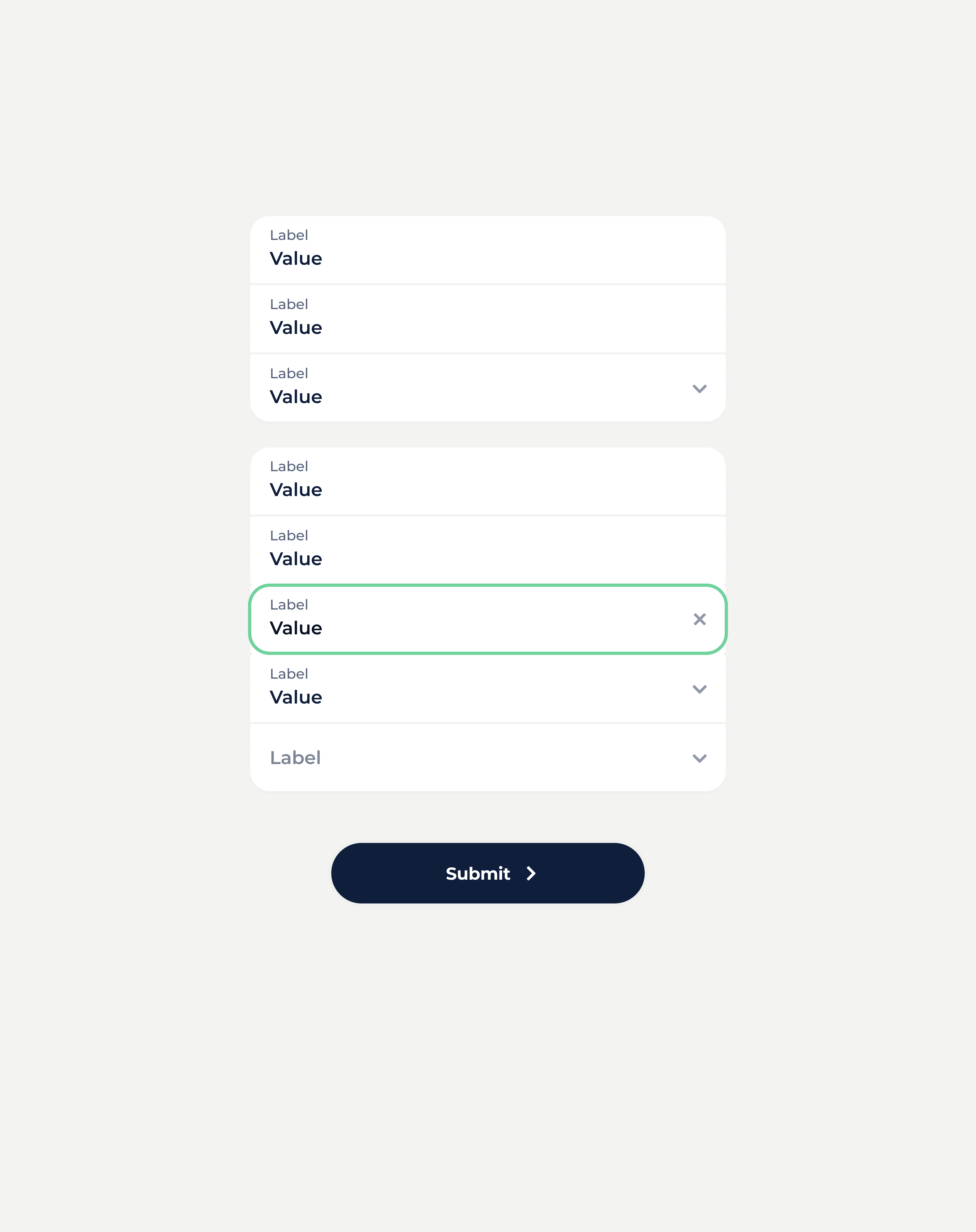
Working on Evia gave me an opportunity to work from a systems level. It started with transforming the previous system and continued to evolve as a robust modular design library. In many instances, I had to work without specifics; we hadn't decided what exact questions would be asked, or how the pouches would be printed. I designed components to be as flexible as possible to accommodate these unknowns.
