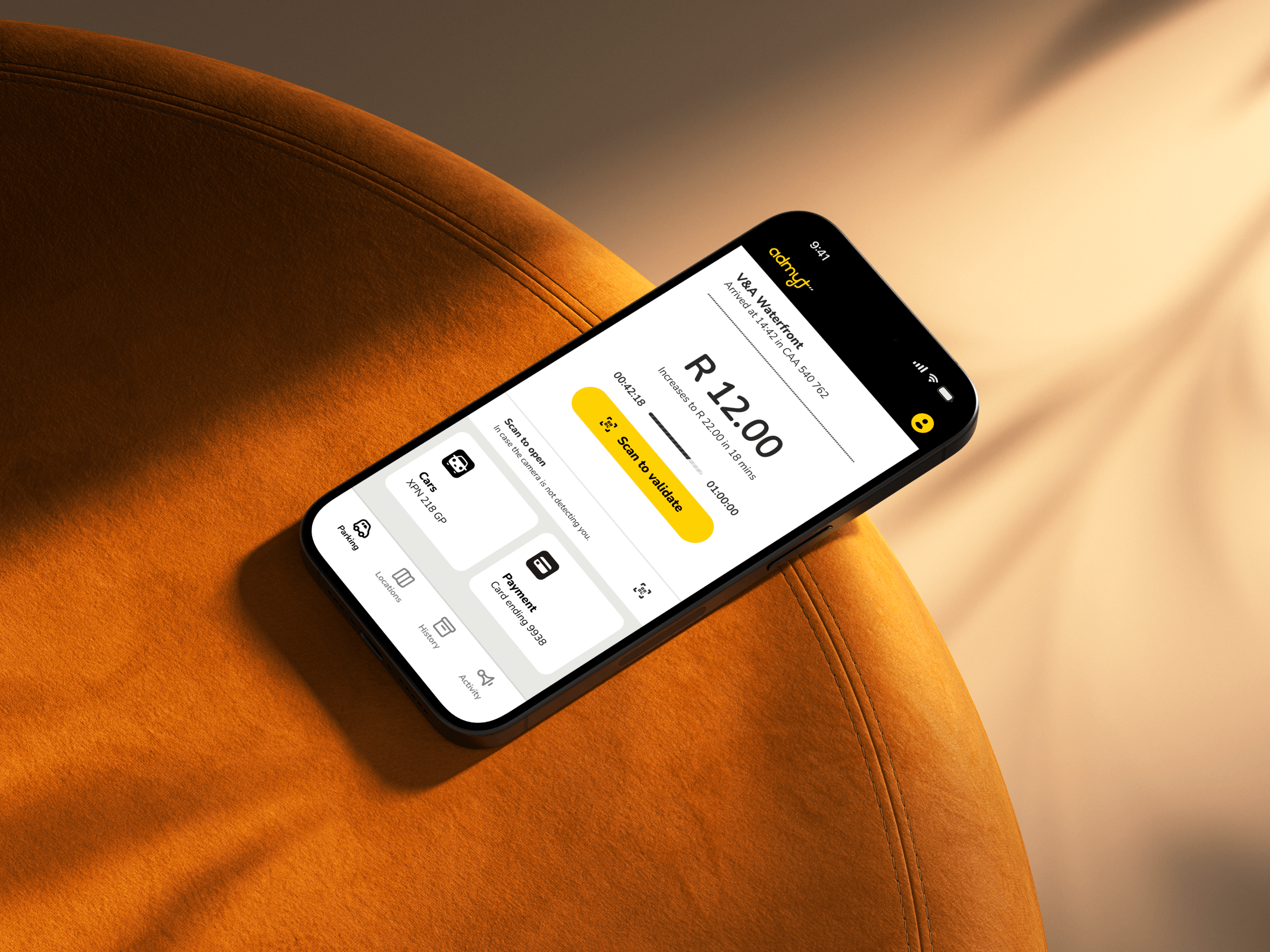
Finding stumbling blocks
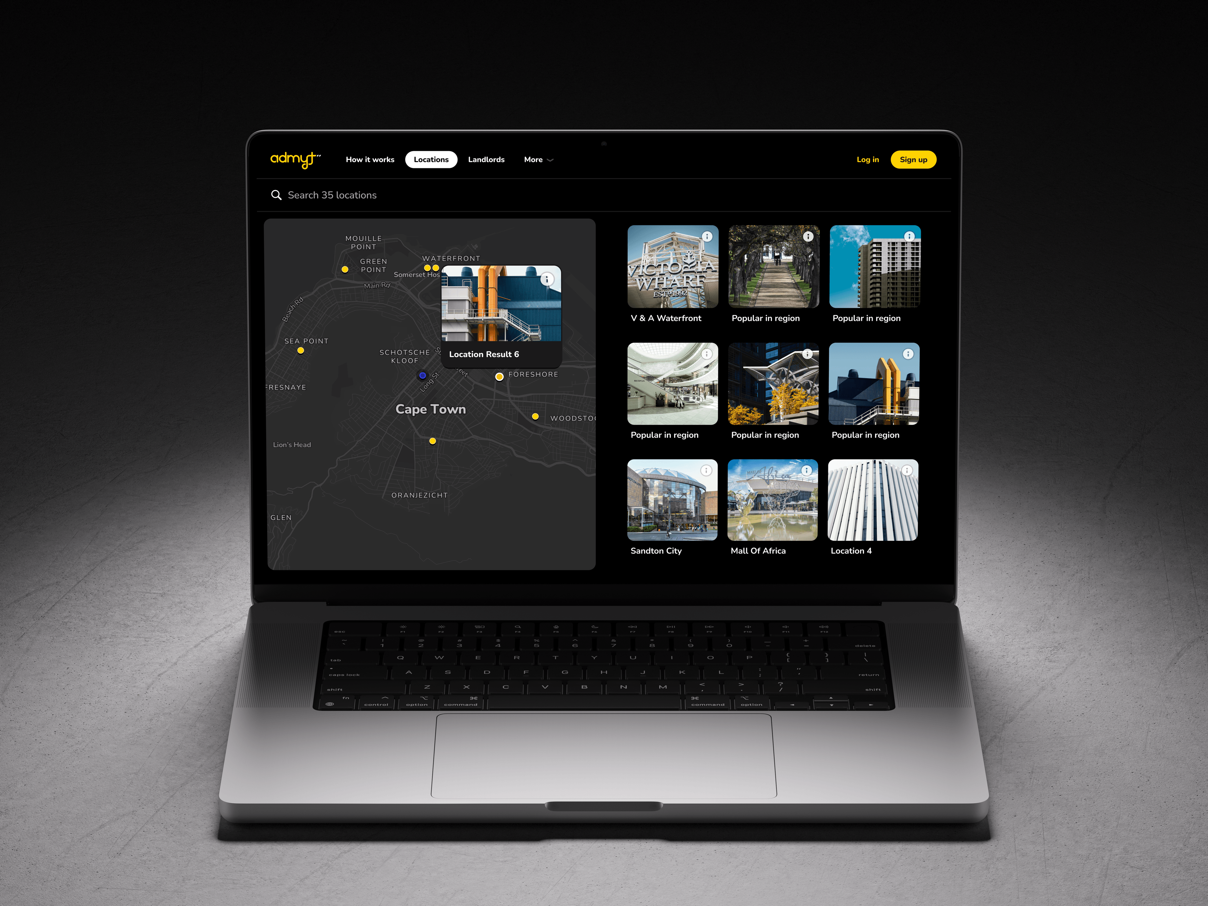
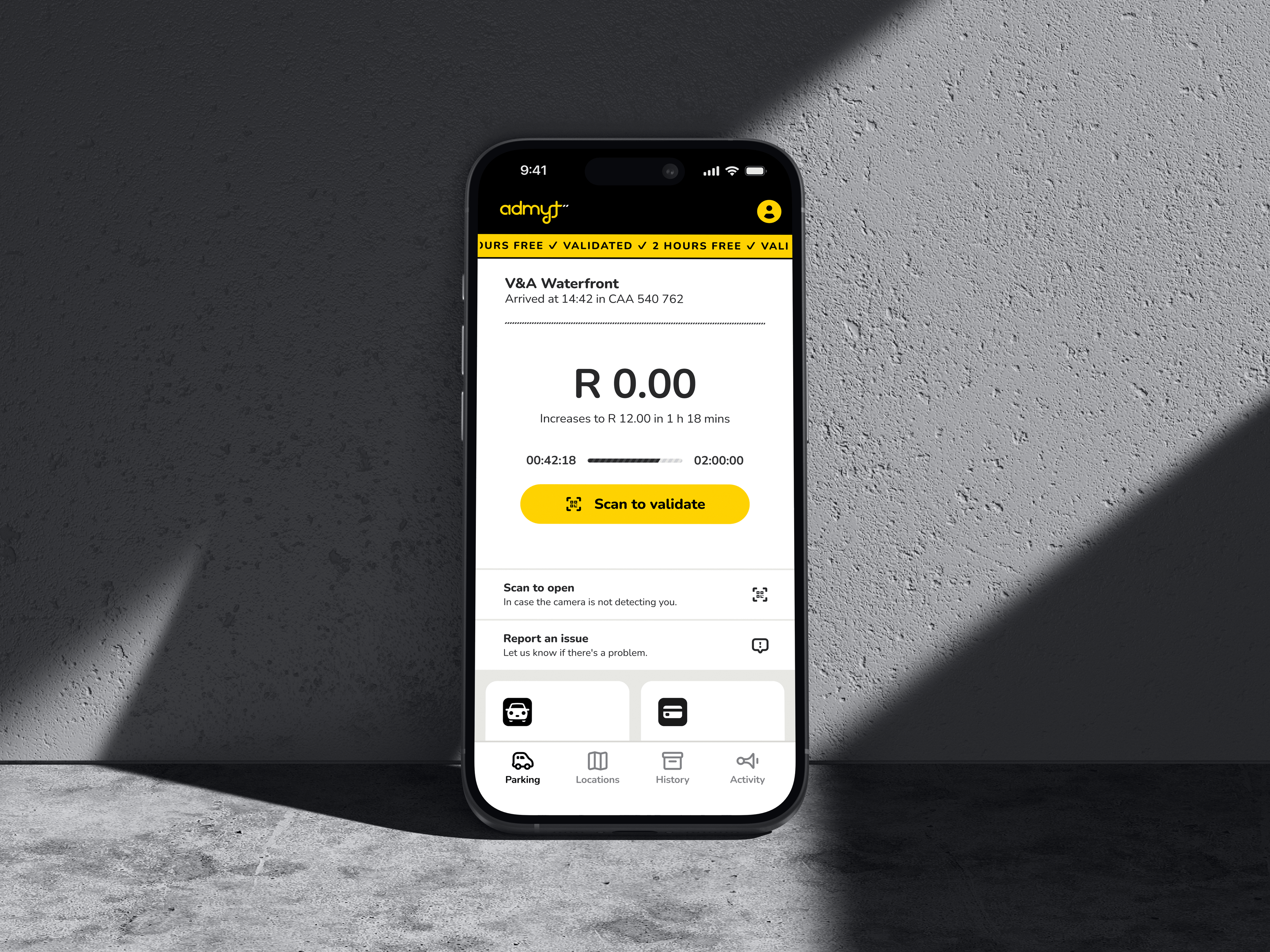
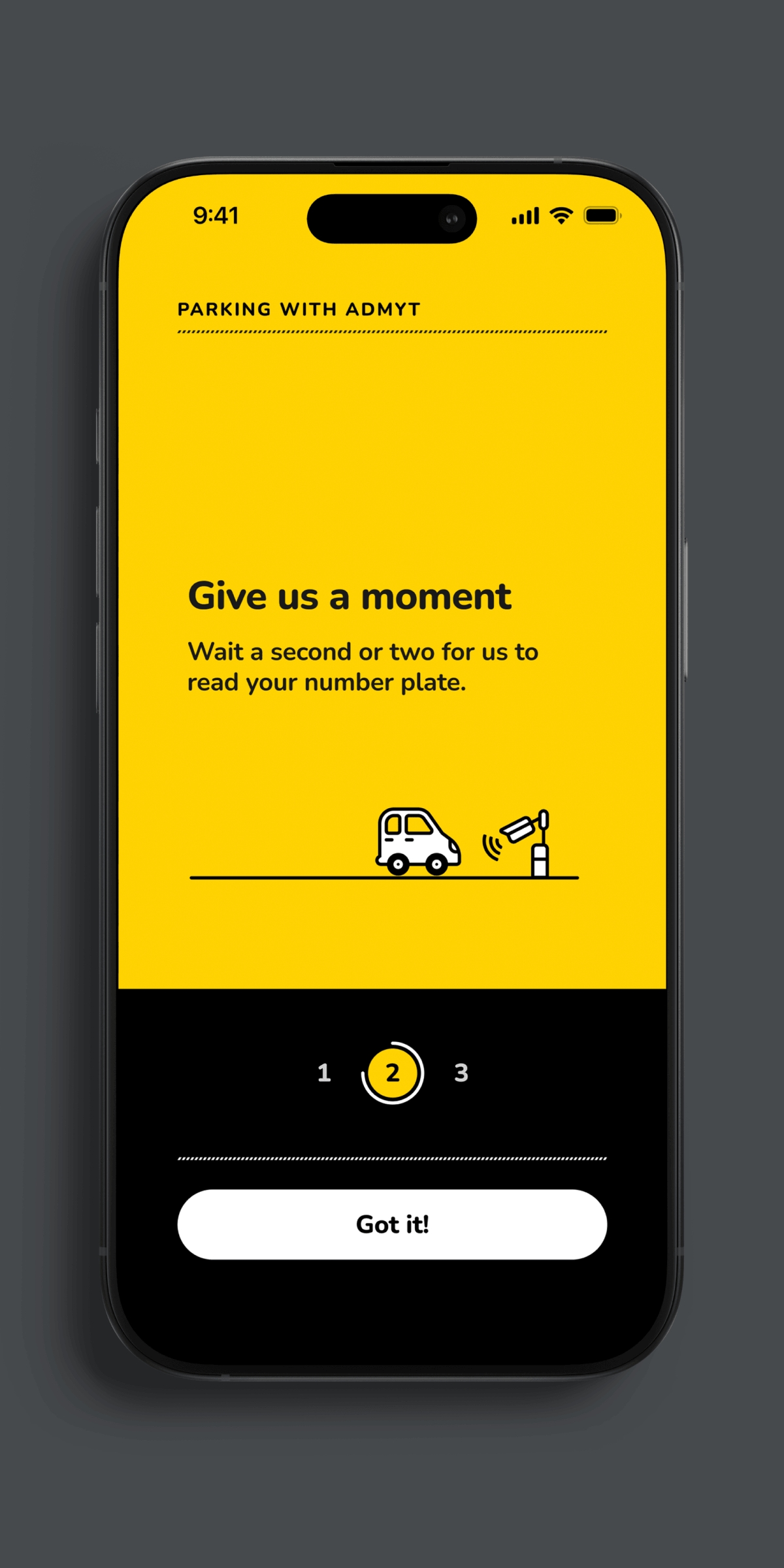
Admyt installs cameras in parking lots that recognise customers’ number-plates to automate access and payment. It's a great solution to the hassle of taking tickets and queueing at stations to pay. They approached us with an established product that already had a high customer-base. It had been noticed, however, that a large number of users never complete onboarding and, of those that do, there was less engagement than expected. From their own data research, they had singled out two areas in the onboarding process that seemed to be the main culprits.
The ask was to conduct an analysis of their entire service offering (consisting of two web-platforms and a mobile application). The first thing I did was conduct an in-field user test with the nearest candidate (me). I created my profile and went to park, making use of all the features on offer, documenting my experience and formulating various hypotheses and solutions.
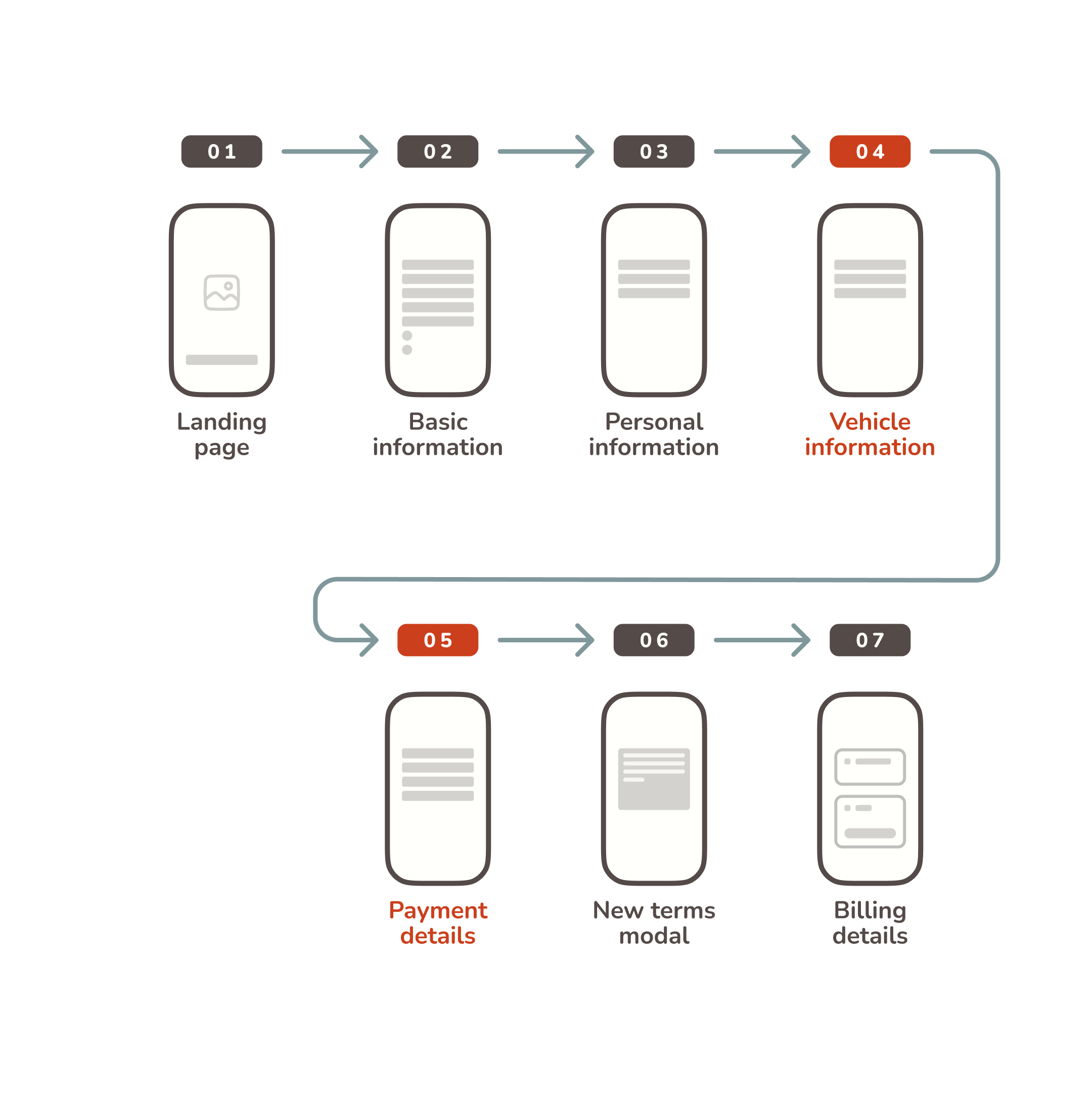
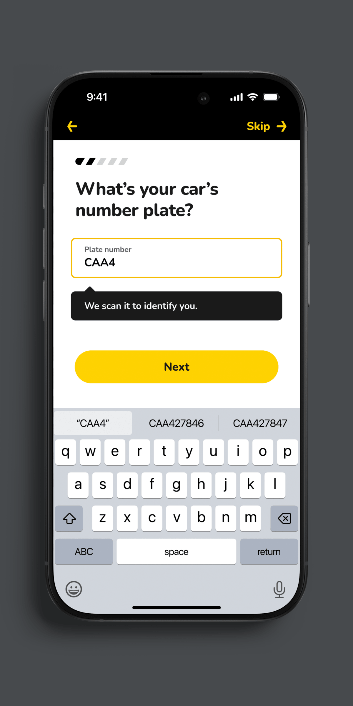
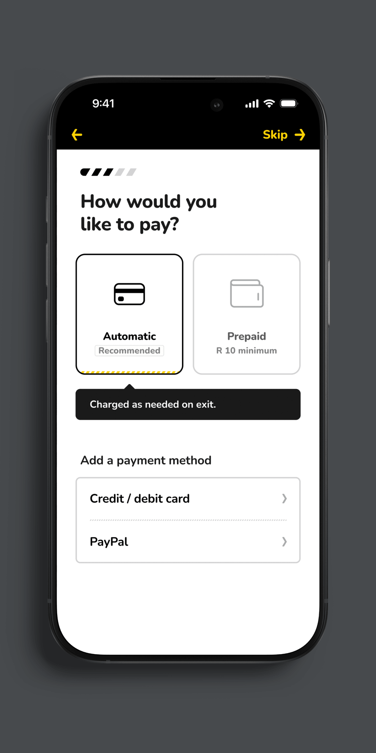
More steps, less distraction
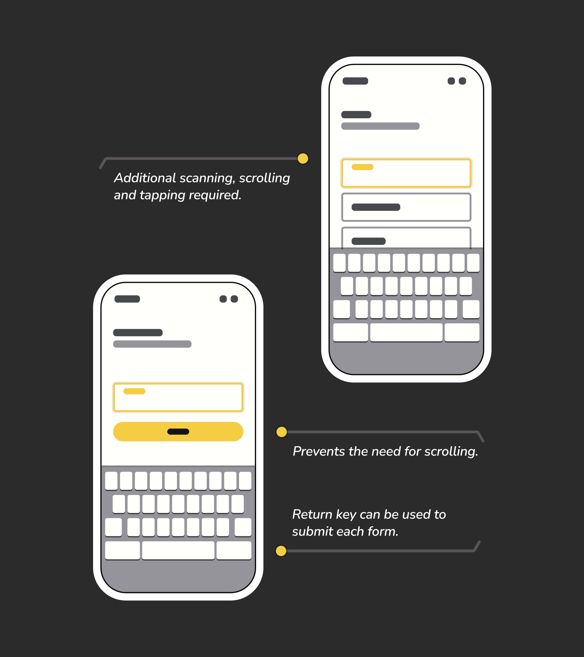
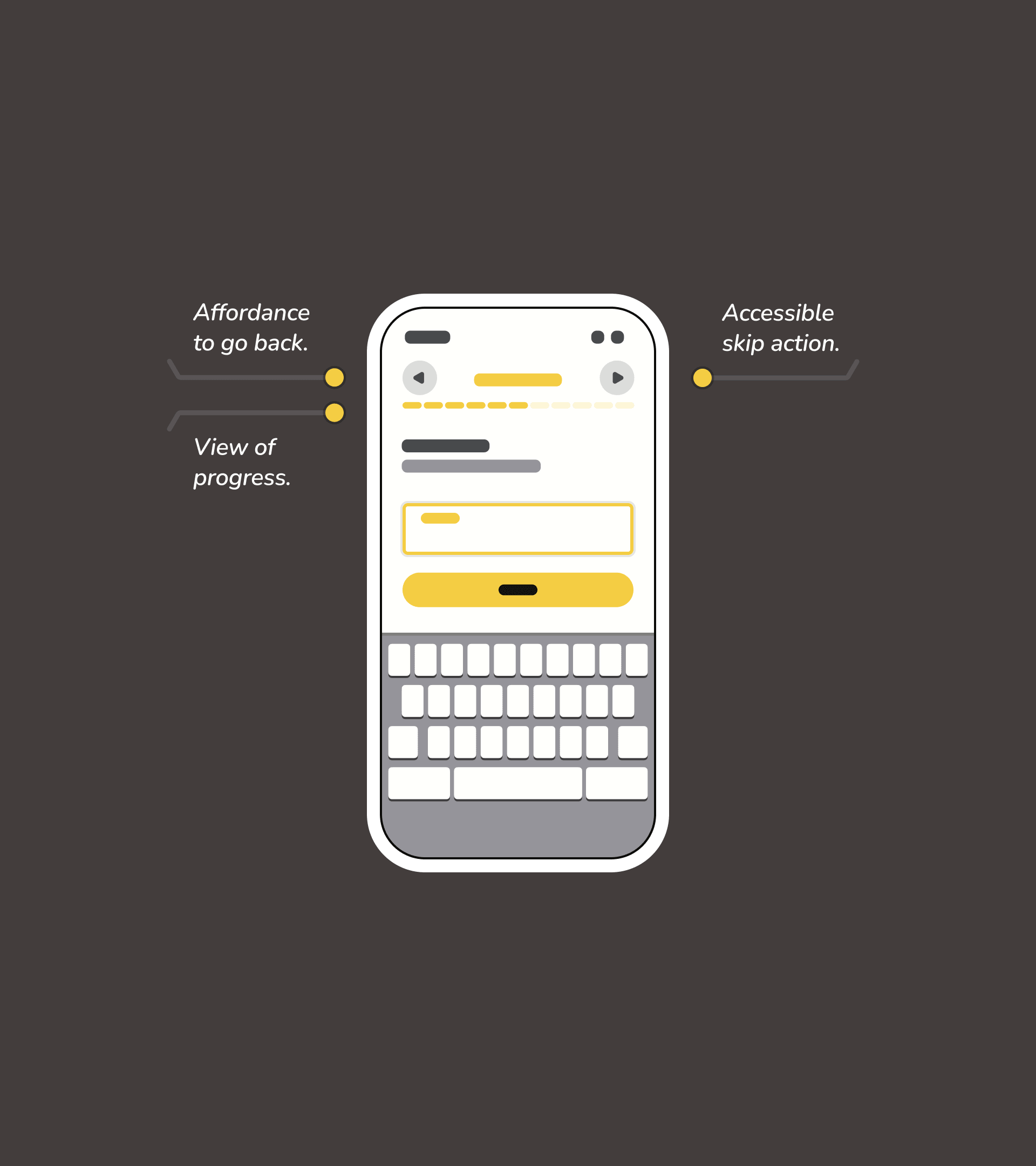
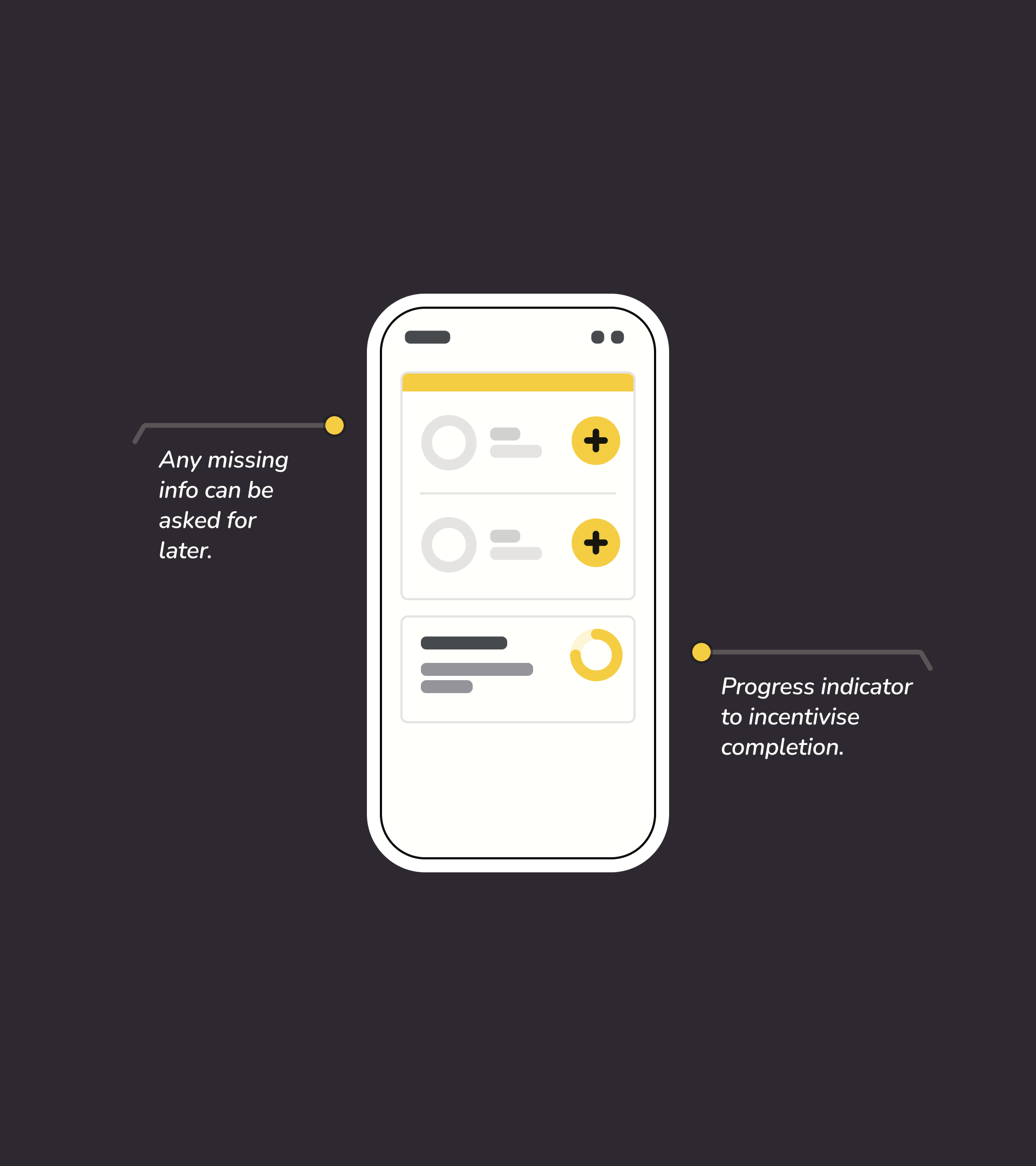
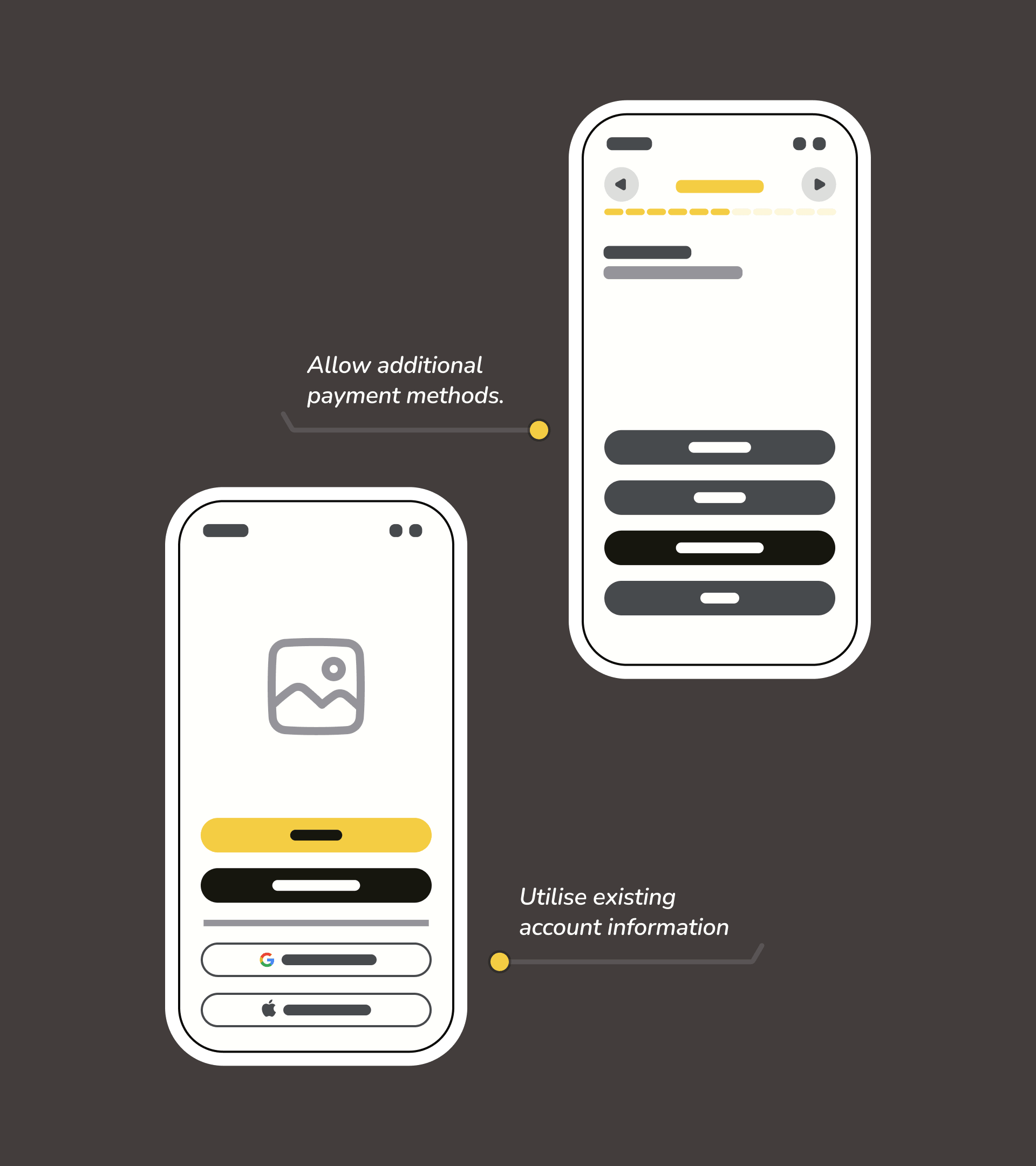
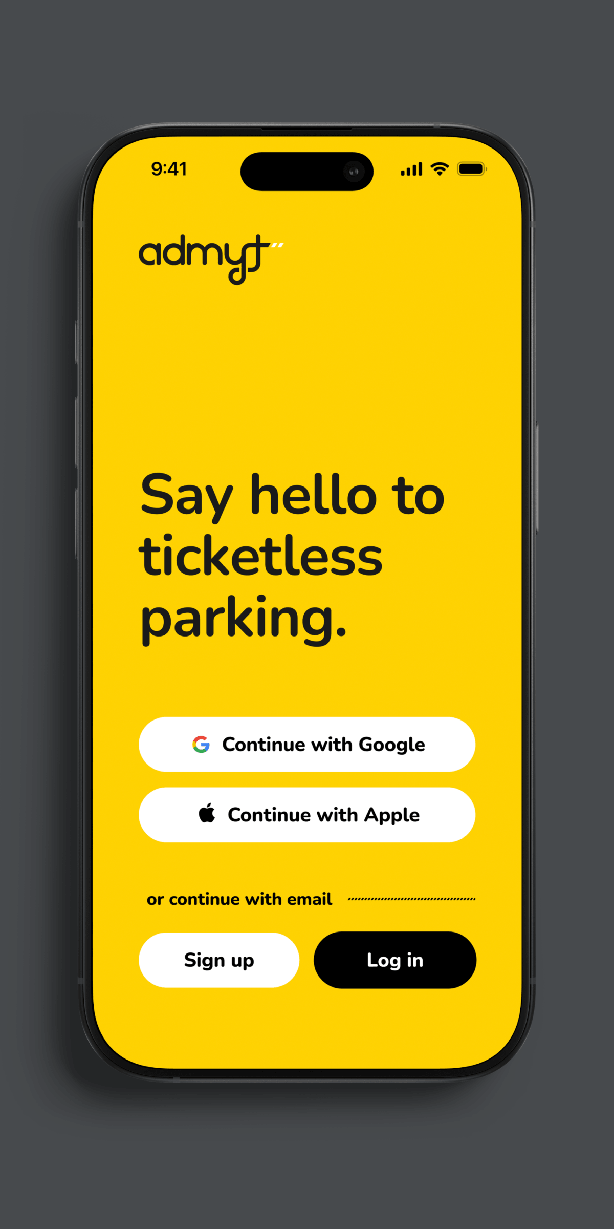
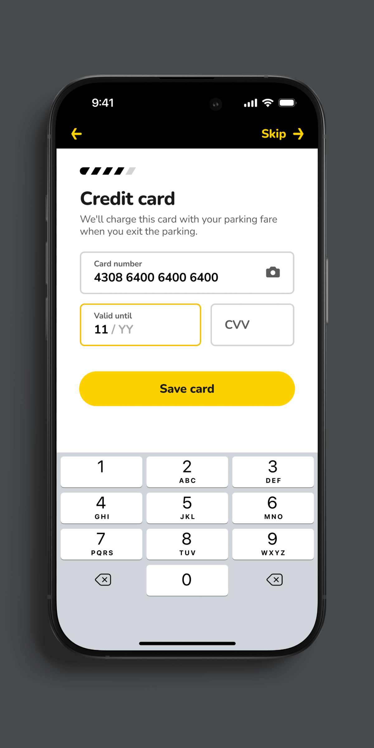
The problem was that the onboarding process asked for details that might not be readily available to users and offered no way to proceed without them. My primary recommendation was to reduce what was asked, limiting it to only the essential, and allow users to skip most steps. We would then do our best with the information that was provided and create a post-onboarding flow to progressively complete any missing information.
It may seem counter intuitive, but my recommended flow actually increased the number of steps in the onboarding. There's a reason that cliché advice is “one step at a time”. Humans are easily overwhelmed and a single field to fill-in is more comprehensible than one amongst many. This has been a constant finding in usability research.
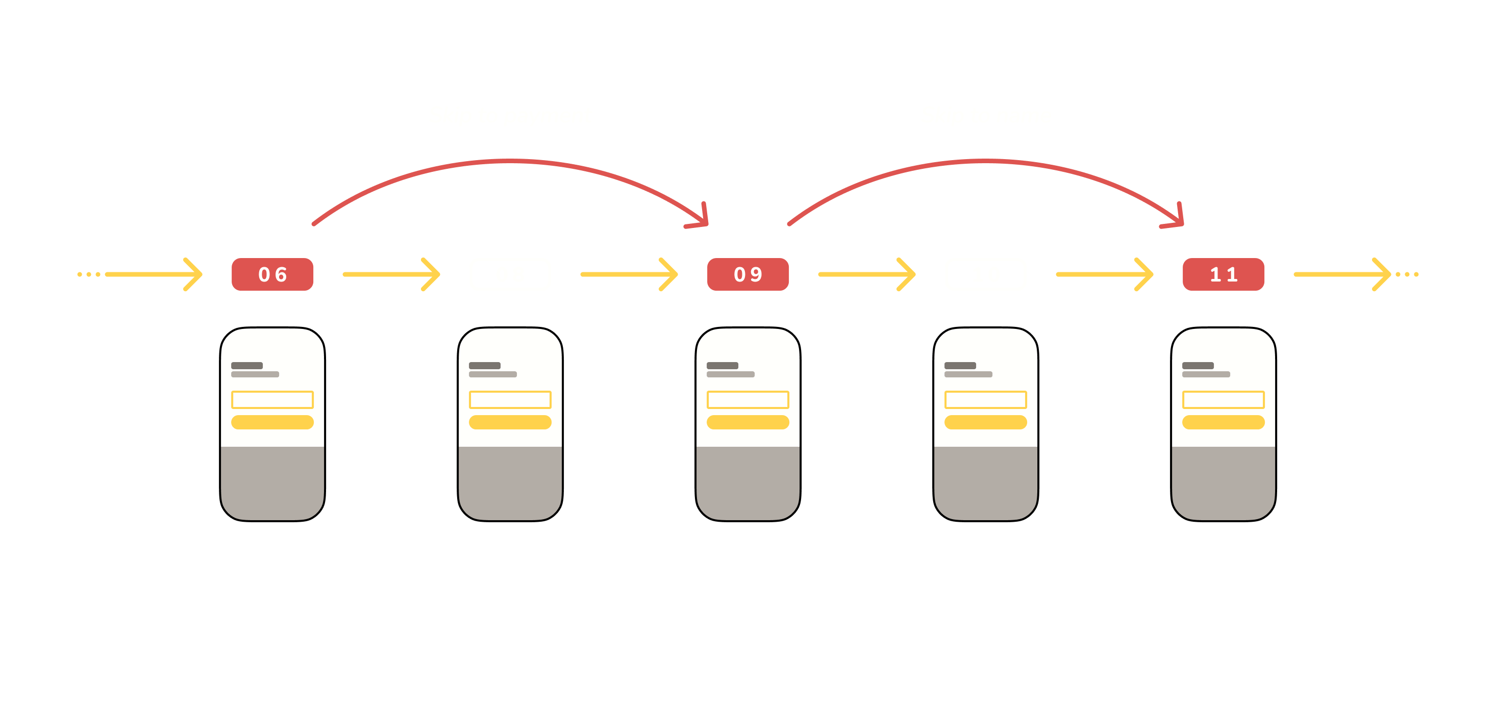
Consolidating and prioritising
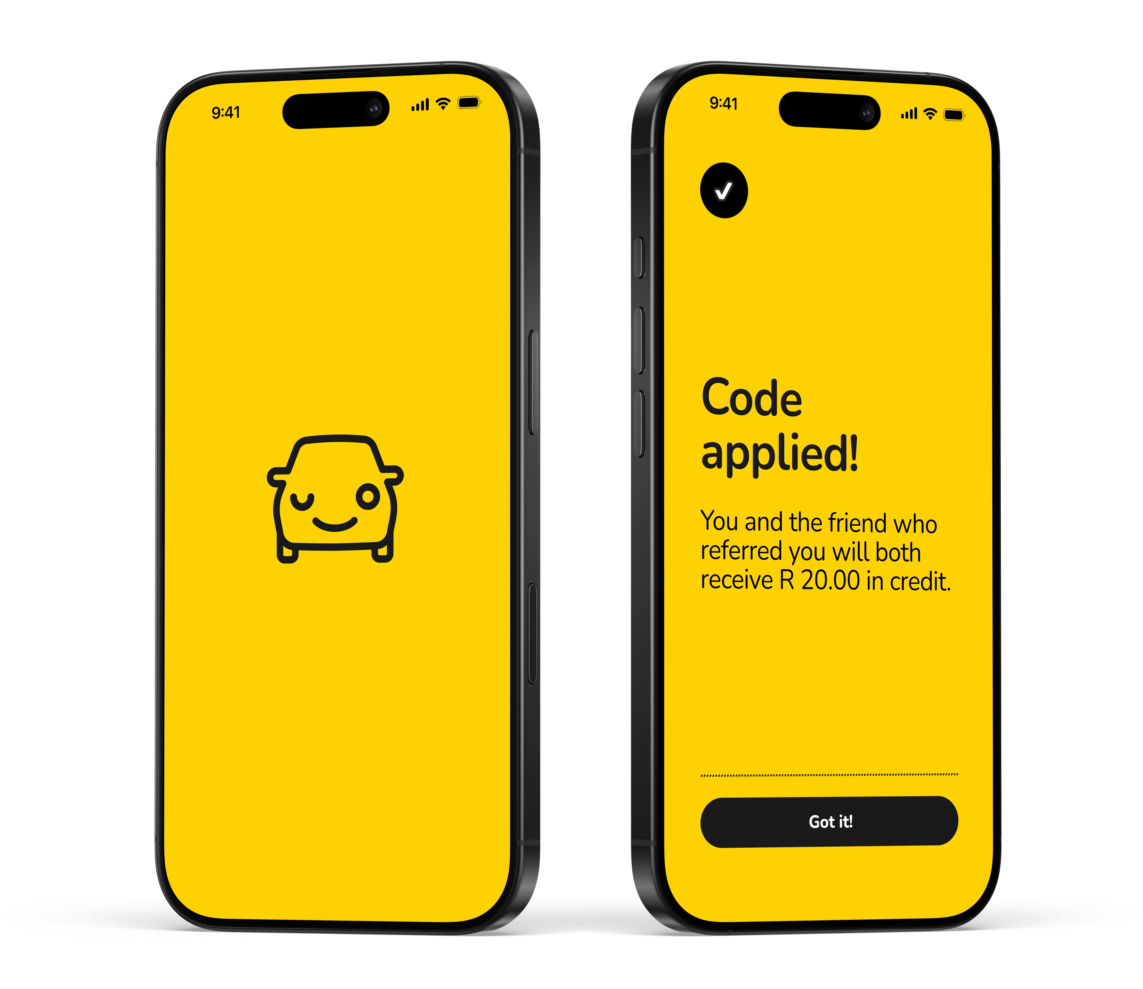
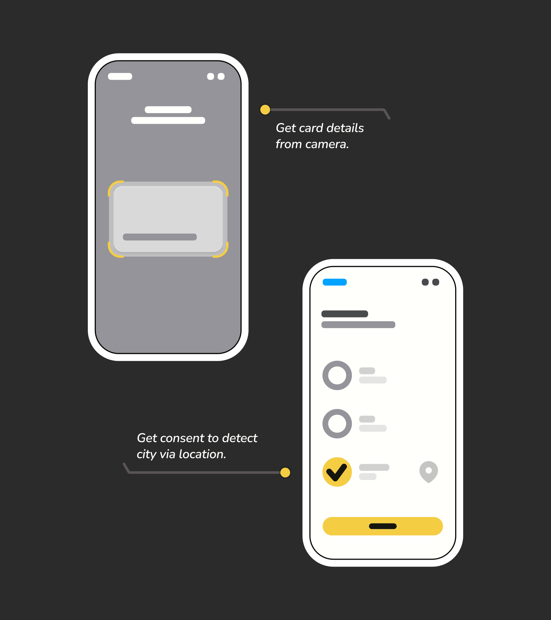
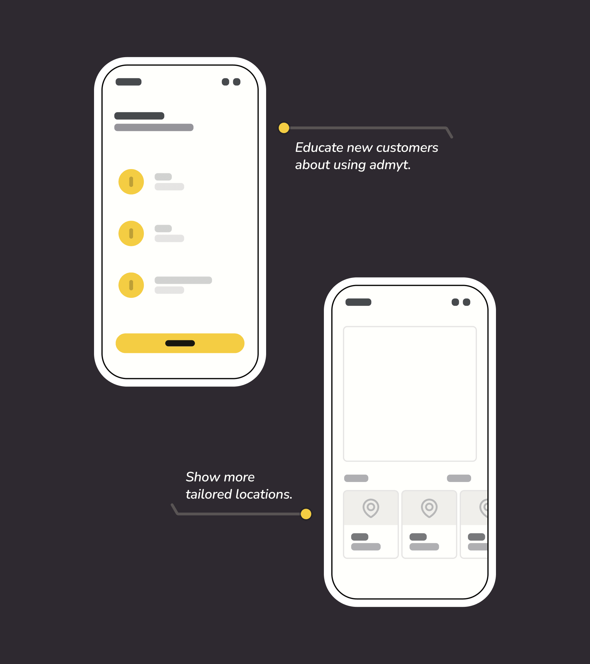
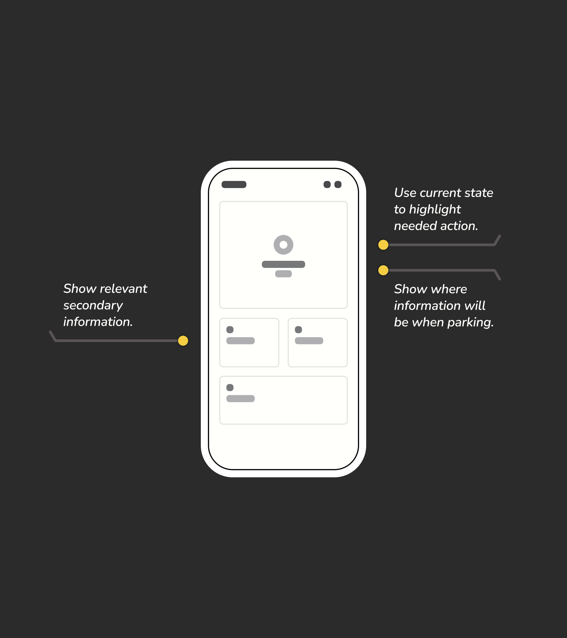
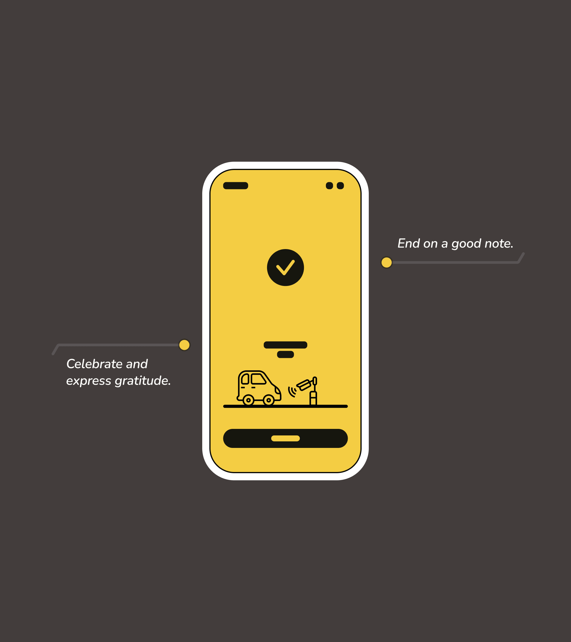
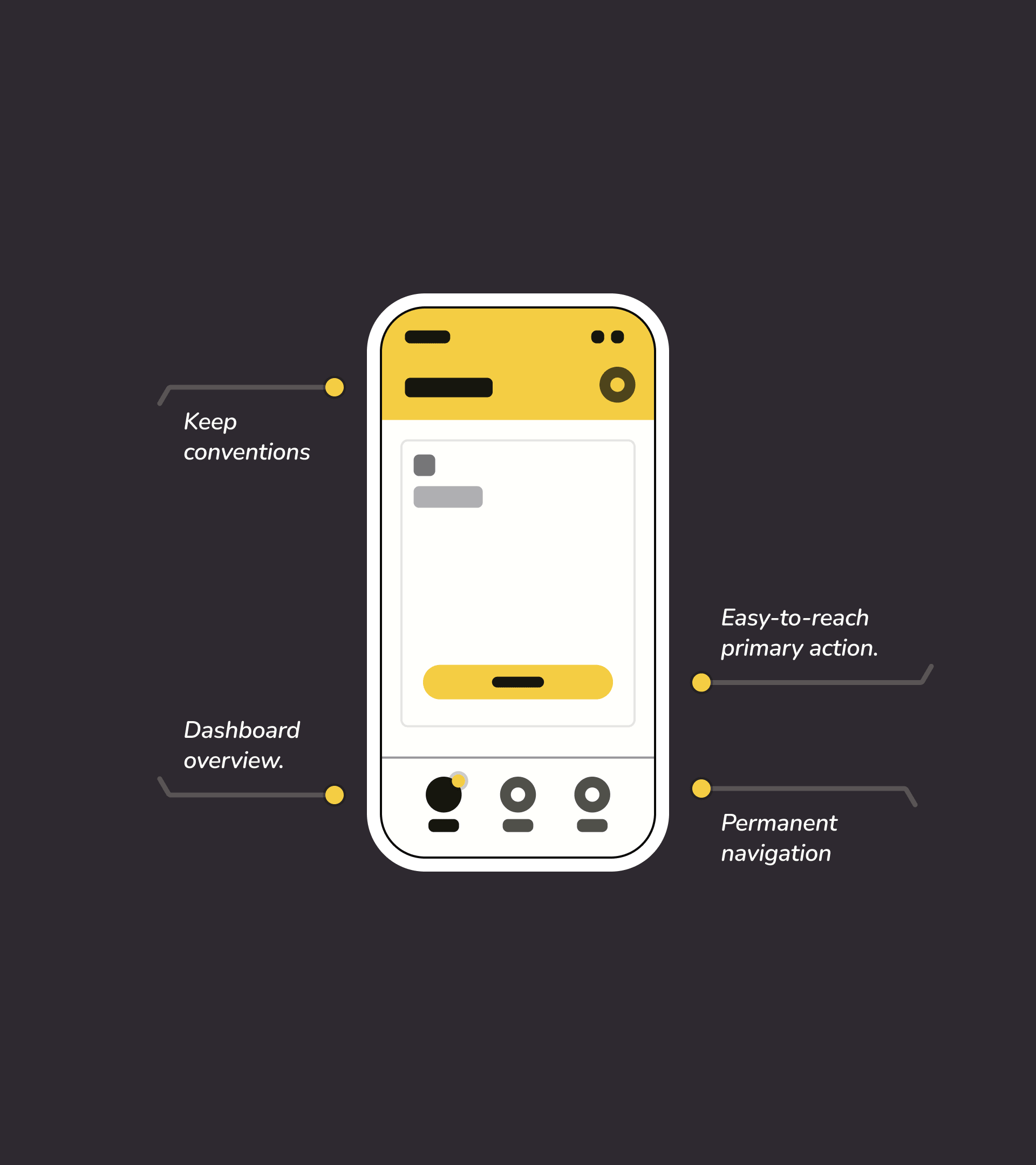
In my analysis, I made a total of 32 recommendations, prioritising things such as creating a permanent “home” to give an overview of customers' status at any given time, but also including non-essential things like creating “moments of delight” to leave a good impression. I presented examples of most of these recommendations using simple wireframes. It’s dangerous to get too detailed before there’s consensus. Keeping it more abstract tends to promote ideas and discussion and avoids going down rabbit holes.
Green lights all the way
It always feels great when people trust you and place their product in your care. I was given the go-ahead to implement the majority of my recommendations. This meant getting stuck into the details.
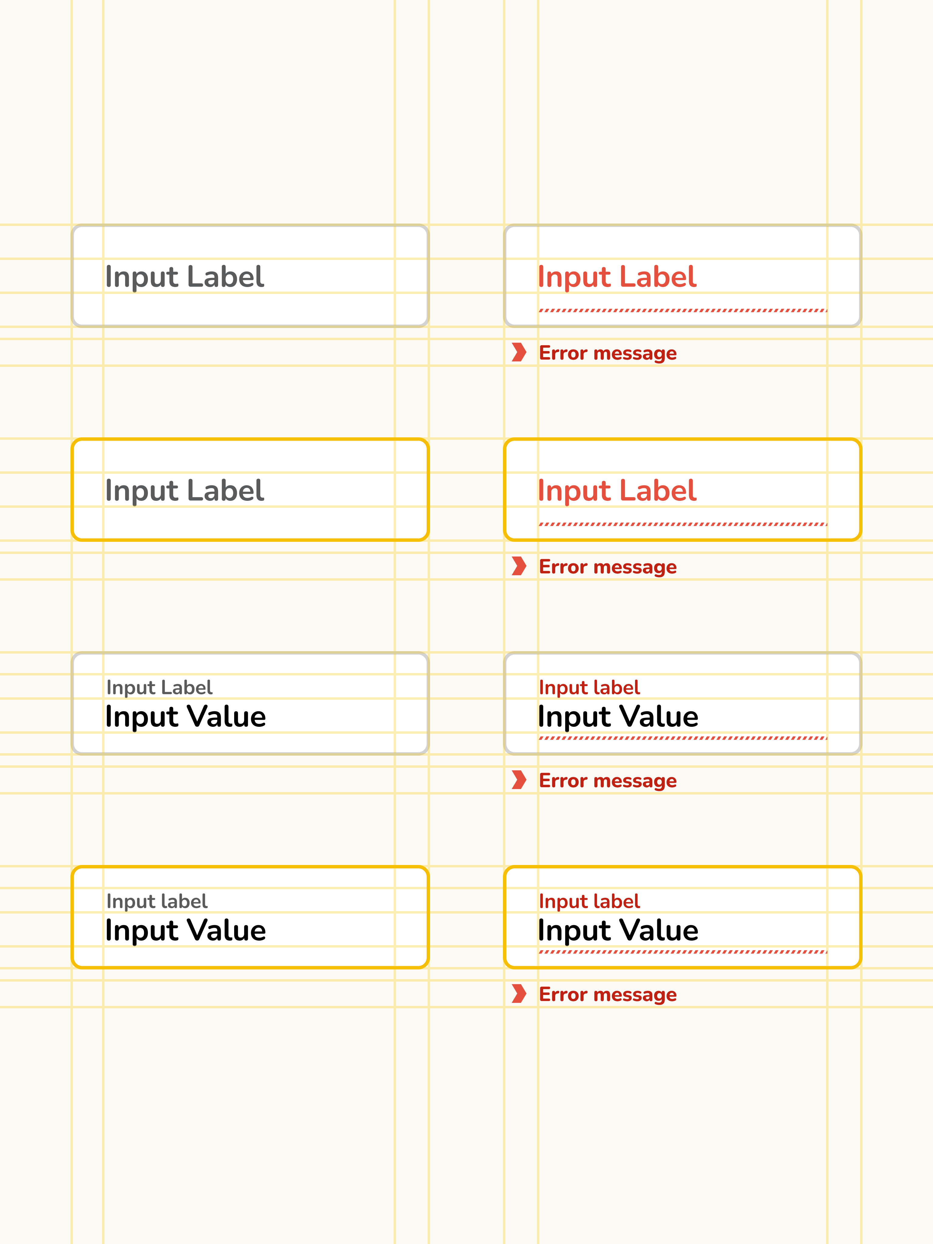
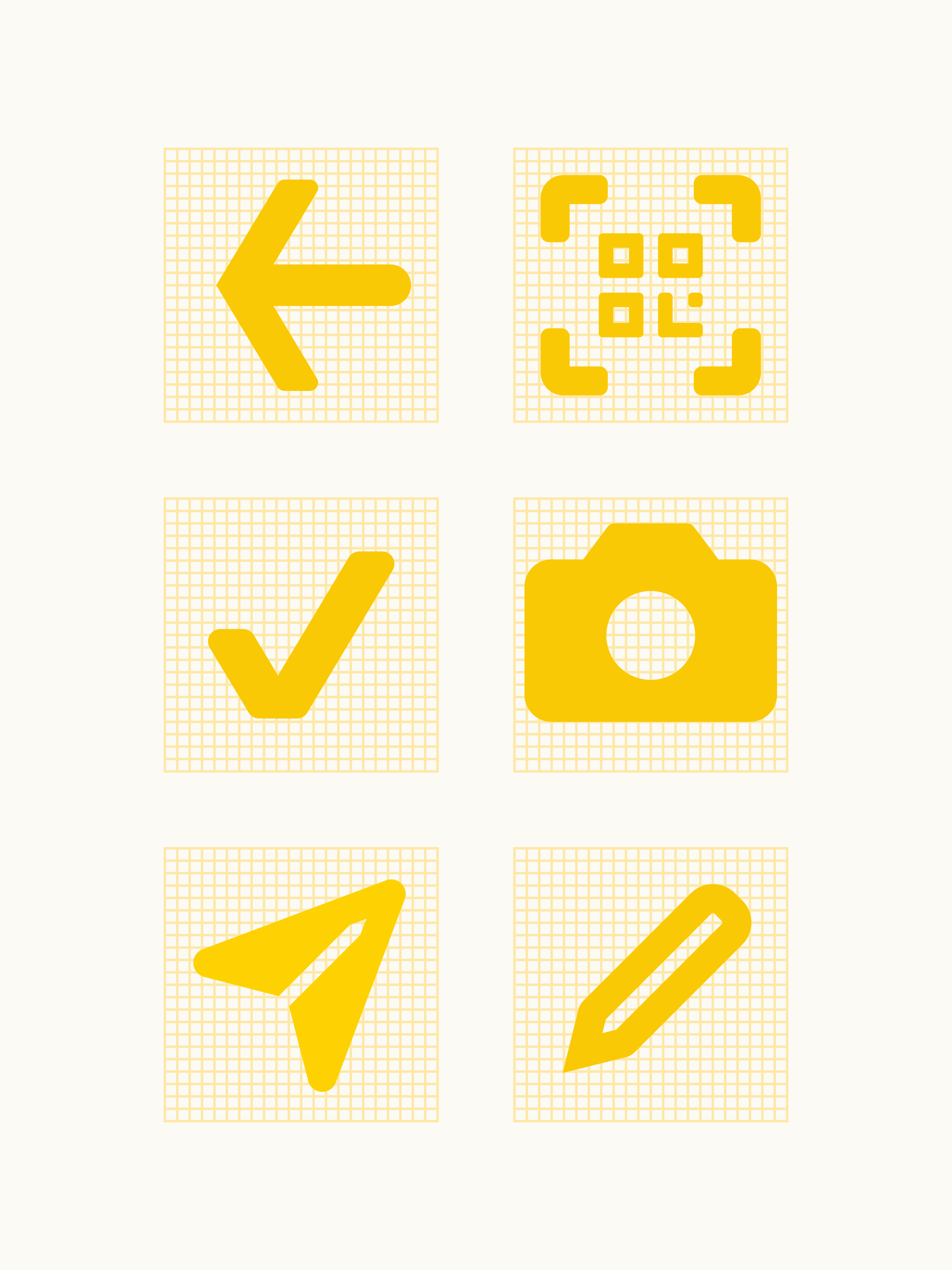
As is often the case with start-ups, there wasn't a well-established design system, so I went about translating their branding guides into a small, but well-documented design library as I created the new flows in line with my recommendations.
Parking between the lines
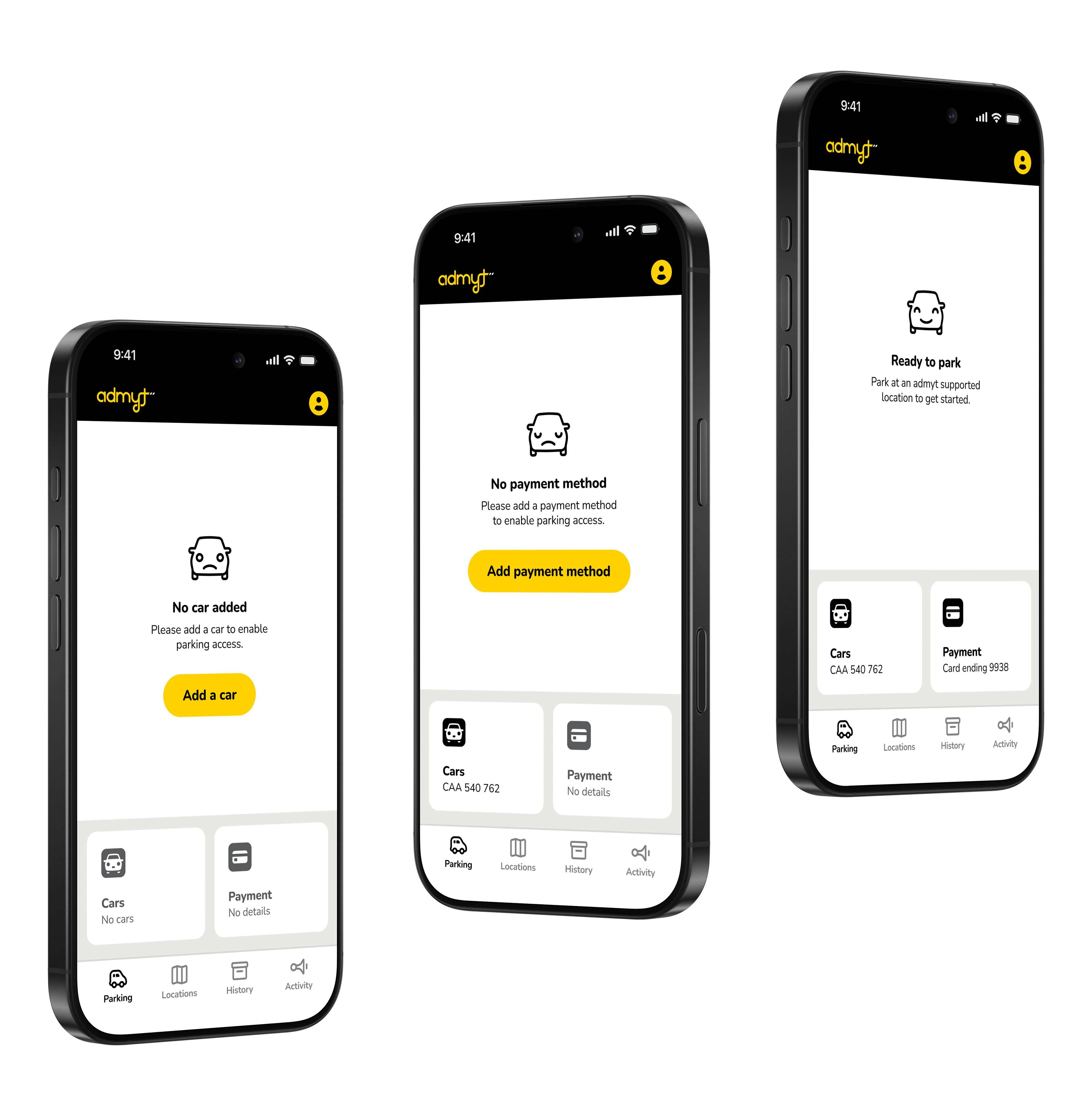
To improve the post-onboarding experience, my main aim was to make the app follow conventions a bit more. The fact that not much happens until you park made it tempting to focus on other areas by default. Being told you're not parked at the moment might seem superfluous, but it communicates a lot: You know there's space that's carved out for you, you're given reassurance that everything is working as expected and have an idea of what will happen when you do park.
I dedicated the majority of the screen to an empty state that would have a corresponding emotion and action when relevant. This also solves the problem that was created by allowing users to skip parts of onboarding. Through empty states, we had a watertight user flow.
